

Are you ready to take your website to the next level with the Eduma theme? Whether you’re building an online course platform, a learning management system, or a simple educational blog, a well-structured menu is crucial for enhancing user experience and navigation. But don’t worry if you’re not tech-savvy! In this step-by-step guide, we’ll walk you through the process of creating a stunning and functional menu using the Eduma theme. By the end, you’ll have a beautifully organized menu that not only looks great but also keeps your visitors engaged and coming back for more. So, let’s roll up our sleeves and dive into the world of Eduma menus—your dream website is just a few clicks away!
Understanding the Basics of the Eduma Theme and Its Menu Features
When navigating the Eduma theme, understanding its menu features is essential for crafting a user-friendly and engaging website. The menu serves as the backbone of your site’s structure, guiding visitors through various sections with ease. With Eduma, you can design a menu that not only looks appealing but also enhances usability.
To create an efficient menu, you’ll first want to consider the key elements that should be included. Here are some essential components:
- Home: A direct link to your homepage for easy access.
- Courses: Highlight your educational offerings and make it easy for users to browse.
- About Us: Provide background information about your organization and its mission.
- Contact: Ensure visitors can reach you for inquiries or support.
- Blog: Share insights, updates, and educational content to engage your audience.
Next, let’s talk about the practical steps to create your menu. Within the WordPress dashboard, navigate to the Appearance section and select Menus. Here you can:
- Select a new menu or edit an existing one.
- Add pages, posts, custom links, or categories to your menu.
- Drag and drop items to arrange them in your preferred order.
- Save the menu and assign it to a specific location in your theme.
For a more customized approach, consider how you want to structure your dropdown menus. Sub-items can be added for a neater organization, ensuring users can find the information they need quickly. Here’s a simple layout idea:
| Main Menu Item | Sub Item |
|---|---|
| Courses | Online Courses |
| Courses | Webinars |
| About Us | Our Team |
| About Us | Our History |
Lastly, don’t forget about the aesthetics! Choose colors, fonts, and styles that align with your brand identity. Eduma offers various customization options that allow you to create a menu that stands out while remaining functional. A well-designed menu not only improves navigation but also encourages users to explore more of what you have to offer.
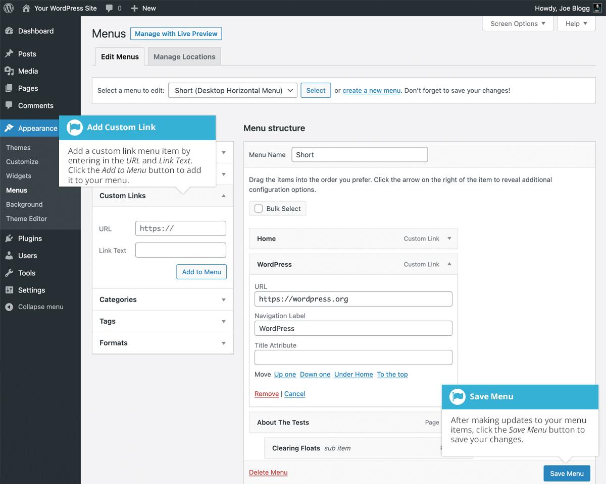
Navigating the WordPress Dashboard to Access Your Menu Settings
Getting familiar with the WordPress Dashboard is crucial for effectively managing your website’s content, especially when it comes to creating and customizing menus. The Dashboard serves as your command center, allowing you to navigate various settings with ease. To access your menu settings, follow these simple steps:
- Log into your WordPress Admin Area: Use your credentials to access the backend of your website.
- Locate the Appearance Menu: On the left-hand sidebar, find the “Appearance” tab and click on it. This is where you’ll manage themes, widgets, and menus.
- Select Menus: Under the Appearance section, you’ll see the “Menus” option. Click on it to open the menu management interface.
Once in the Menus section, you’ll notice several key areas that will help you customize your site’s navigation:
| Menu Area | Description |
|---|---|
| Menu Name | Name your menu so you can identify it later. |
| Add Menu Items | Select pages, posts, or custom links to include in your menu. |
| Menu Settings | Choose your display location and set your primary menu. |
After setting up your menu structure, it’s important to save your changes. You’ll find a “Save Menu” button on the right side of the screen. Don’t forget to check that your newly created menu is assigned to the correct location, typically indicated as the primary navigation menu in the Eduma theme.
Lastly, feel free to customize the order of menu items by simply dragging and dropping them into your desired position. This intuitive process allows you to create a seamless navigation experience for your visitors, enhancing usability and encouraging them to explore more of your content.
Crafting Your Menu Structure: Tips for Organizing Pages and Categories
When it comes to building a menu in the Eduma theme, having a well-organized structure is crucial. A clear and intuitive menu not only enhances user experience but also improves navigation across your site. The first step is to identify the main categories that best represent your content. Think about what your audience is looking for and how they might search for it. This lays the groundwork for a logical and effective menu layout.
Start by considering the following categories that can serve as the backbone of your menu:
- Courses: Showcase your offerings clearly, making it easy for users to find specific subjects or levels.
- Blog: Share insights, updates, and articles that resonate with your audience.
- About Us: Provide a brief overview of your institution, mission, and values.
- Contact: Ensure users can reach out for inquiries or support.
- Resources: Offer valuable tools, guides, or downloads that enhance the learning experience.
Once you’ve outlined your categories, it’s time to think about the submenu items that will reside under each section. This is where you can get specific. For instance, under the “Courses” category, you could include:
| Course Level | Subject Area |
|---|---|
| Beginner | Introduction to Programming |
| Intermediate | Web Development |
| Advanced | Data Science |
It’s essential to keep your menu clean and concise. Overloading it with too many items can overwhelm users and lead to confusion. Opt for a dropdown format for subcategories to keep the main menu streamlined. You can also use icons or short descriptors to make it visually appealing and easier to navigate.
regularly revisiting and updating your menu structure based on user feedback and analytics can make a significant difference. Pay attention to which pages are most visited and ensure that they are easily accessible. A well-crafted menu not only facilitates better navigation but also encourages visitors to explore more of what your site has to offer.
Adding Custom Links to Enhance Navigation and User Experience
Enhancing user experience on your website goes beyond just good design; it’s about making navigation intuitive and seamless. By adding custom links to your menu, you can guide users to essential pages, resources, and features that they might otherwise overlook. This not only improves usability but also keeps visitors engaged longer.
When considering which custom links to add, think about the key areas of your site that are most valuable to your users. Here are some suggestions:
- Course Categories: Direct links to specific course categories can help users find what they’re looking for quickly.
- Blog: A link to your blog keeps users updated on the latest news, tips, and resources.
- Support: An easily accessible support link encourages users to reach out with questions, making them feel valued and supported.
- Testimonials: Highlighting success stories can inspire potential students and build trust.
- Contact Us: Providing a direct line of communication fosters a sense of community.
To implement these custom links in your Eduma theme, navigate to the WordPress dashboard, go to Appearance > Menus, and select the menu you want to modify. Here, you can easily add your custom links by pasting the URL and naming the link. Don’t forget to save your changes!
For those looking to add a more structured approach to presenting your custom links, consider using a table format. Here’s a simple example:
| Link Title | URL |
|---|---|
| Course Categories | yourwebsite.com/course-categories |
| Blog | yourwebsite.com/blog |
| Support | yourwebsite.com/support |
| Testimonials | yourwebsite.com/testimonials |
| Contact Us | yourwebsite.com/contact |
With these custom links, you’ll improve your site’s navigation and foster a user-friendly environment that keeps your visitors returning. Don’t underestimate the power of a well-structured menu; it can significantly impact your site’s overall performance and user satisfaction.
Styling Your Menu: Best Practices for Eye-Catching Design
Creating a visually appealing menu is crucial for engaging users and enhancing their browsing experience. A well-designed menu not only guides your visitors but also reflects your brand’s identity. Here are some best practices to consider when styling your menu in the Eduma theme.
Prioritize Clarity and Simplicity: Your menu should be easy to navigate. Keep it concise and avoid overcrowding with too many items. A cluttered menu can overwhelm users, making it harder for them to find what they’re looking for. Aim for clarity:
- Use clear and descriptive labels.
- Group related items together.
- Limit the number of menu items to 7-10 for optimal usability.
Utilize Visual Hierarchy: Implement a visual hierarchy to guide users through your menu. Use font sizes, colors, and styles to differentiate between primary and secondary items. For example, you could make primary categories bold and larger, while subcategories remain smaller and lighter in color. This helps draw attention to the most important links, ensuring users don’t miss them.
Incorporate Colors and Fonts Wisely: Your color scheme should align with your brand while providing enough contrast to ensure readability. Stick to a limited color palette for a cohesive look. When it comes to fonts, choose one or two that complement each other without distracting from the menu items. Use CSS classes to style your menu text for consistency:
.menu-item { font-family: 'Arial', sans-serif; color: #333; }
.menu-item:hover { color: #007BFF; }
Responsive Design is Key: Ensure that your menu looks great on all devices. The Eduma theme offers mobile-friendly options, but it’s essential to test your menu’s responsiveness. Consider implementing a hamburger menu for mobile devices, which can save space and keep your design sleek. Remember, a seamless experience across devices encourages users to stay longer on your site.
Use Icons and Visual Elements: Adding icons next to your menu items can enhance visual appeal and improve recognition. Icons can quickly convey the meaning of each menu item, making it easier for users to identify them. You can use Font Awesome or other icon libraries to find appealing and relevant icons. For example:
| Menu Item | Icon |
|---|---|
| Home | |
| About Us | |
| Courses |
By implementing these styling best practices, you can create a menu that not only looks fantastic but also functions effectively, ensuring your visitors have an enjoyable experience navigating your site.
Leveraging Mega Menu Options for a Dynamic User Interface
When designing a website with the Eduma theme, one of the standout features is the ability to create dynamic mega menus that enhance user navigation. This functionality not only improves user experience but also allows for a richer presentation of content. With a well-structured mega menu, you can showcase multiple categories and subcategories, making it easier for visitors to find what they’re looking for.
To start leveraging mega menu options, consider the following strategies:
- Organize Content Logically: Group related items together to help users navigate intuitively. For instance, if you’re offering courses, categorize them by subject matter or skill level.
- Use Visuals: Incorporate icons or images next to menu items. This visual cue not only beautifies your menu but also aids users in quickly identifying the content they are interested in.
- Include Call-to-Actions: Strategically place buttons or links in your mega menu that guide users to sign up, learn more, or take other actions that could lead to conversions.
Furthermore, utilizing the Eduma theme’s built-in customization tools is essential for maximizing your mega menu’s potential. Here’s a simple table showcasing some of the customizable elements:
| Element | Description | Customization Options |
|---|---|---|
| Menu Background | Sets the visual appeal of your menu. | Colors, Gradients, Images |
| Font Styles | Enhances readability and brand identity. | Font Family, Size, Weight |
| Hover Effects | Improves interactivity and user engagement. | Animations, Color Changes |
don’t overlook the importance of mobile responsiveness. With a growing number of users accessing websites via smartphones and tablets, ensuring that your mega menu is mobile-friendly is crucial. Test the layout and functionality on various devices to ensure a seamless user experience across platforms. By prioritizing mobile usability, you’ll create a website that not only attracts but retains visitors.

Troubleshooting Common Menu Issues and How to Fix Them
When working with the Eduma theme, you might encounter some common menu issues that can be frustrating. Fortunately, many of these problems have straightforward solutions. Here’s a guide to help you troubleshoot and resolve them effectively.
One frequent issue is the menu not displaying correctly on the front end. This can happen for a variety of reasons:
- Theme Settings: Ensure that your menu is assigned to the correct location in the theme settings. Navigate to Appearance > Menus and check your menu settings.
- Cache Issues: Sometimes, your browser’s cache may prevent new changes from appearing. Clear your cache or try accessing your site in an incognito window.
- Plugin Conflicts: Deactivate any plugins that might interfere with menu functionality, as some plugins can override theme settings.
If your menu items are not clickable or lead to the wrong pages, verify the following:
- Correct Links: Double-check that all menu item links are set correctly in the Menu Structure section.
- Custom Links: If using custom links, ensure they are formatted properly, including the full URL (e.g.,
https://yourwebsite.com/page). - Permissions: Ensure users have the correct permissions to access the pages linked in the menu.
Another common problem is the menu not being responsive on mobile devices. Here are some tips to enhance mobile usability:
- Mobile Menu Settings: Check if your theme has specific mobile menu settings that need to be configured.
- Responsive Design: Test your menu layout on different devices to ensure it adjusts properly. Use tools like Google’s Mobile-Friendly Test for insights.
- CSS Adjustments: If necessary, add custom CSS to improve the appearance of the menu on smaller screens, making it more user-friendly.
If you’ve gone through these common issues but still face problems, consider creating a backup of your menu and resetting it. Sometimes starting fresh can resolve hidden conflicts. If all else fails, reaching out to the Eduma support team can provide specialized assistance tailored to your needs.

Responsive Design: Ensuring Your Menu Works on All Devices
In today’s digital landscape, ensuring that your website’s menu is responsive and works seamlessly across all devices is crucial. A well-designed menu not only enhances user experience but also contributes significantly to your site’s accessibility and functionality. With the Eduma theme, you have the tools at your disposal to create a menu that looks great and performs well on desktops, tablets, and smartphones alike.
To start, focus on a mobile-first design approach. This means designing your menu for smaller screens before expanding it for larger displays. By prioritizing mobile functionality, you cater to the growing number of users accessing websites via their smartphones. The Eduma theme offers a variety of responsive menu options, including dropdowns and submenus that collapse neatly on mobile devices, allowing for an uncluttered interface.
Another essential aspect is to utilize CSS media queries to adjust the styling of your menu based on the device’s screen size. This allows you to change the layout, font sizes, and spacing dynamically. For instance, on a mobile device, you might want to increase the touch target of menu items for easier navigation:
    @media (max-width: 768px) {
        .menu-item {
            padding: 15px 20px;
            font-size: 18px;
        }
    }
Consider implementing a hamburger menu for mobile views, which provides a clean and minimalistic way to house your navigation links. Many users are familiar with this design, making it an intuitive choice. The Eduma theme allows you to easily integrate this feature, ensuring that your menu remains accessible without overwhelming the user.
Lastly, conduct thorough testing across various devices and browsers. Pay attention to how your menu performs in different environments, checking for responsiveness and ease of use. Tools like Google’s Mobile-Friendly Test can help identify any areas for improvement. Regularly update and optimize your menu based on user feedback and analytics to ensure it continues to meet the needs of your audience.
Updating and Managing Your Menu for Continued Relevance
Maintaining an engaging and relevant menu is crucial for your website’s success. As your audience grows and their interests evolve, it’s important to adapt your menu accordingly. Regular updates not only enhance user experience but also improve search engine optimization (SEO), helping you attract more visitors.
When it comes to managing your menu, consider these essential strategies:
- Analyze User Behavior: Use analytics tools to track which pages users visit most. This data can guide what to feature prominently on your menu.
- Streamline Navigation: Avoid clutter by keeping your menu organized. Group related items together and limit the number of top-level categories to make navigation intuitive.
- Highlight Important Content: Make sure your most important pages are easily accessible. This includes current promotions, popular courses, or key information that you want your visitors to see first.
In addition to regular audits, consider seasonal updates. Just as restaurants change their menus based on the season, your website can benefit from refreshing its offerings. This could mean promoting new courses during the back-to-school season or showcasing special events during holidays.
Here’s a quick overview of how often to update different sections of your menu:
| Menu Section | Update Frequency |
|---|---|
| Featured Courses | Monthly |
| Promotions | Weekly |
| Blog Posts | Bi-weekly |
| Testimonials | Quarterly |
don’t forget to seek feedback from your users. Engaging with your audience can provide valuable insights into what they want to see on your menu. Consider creating a survey or encouraging comments on your social media platforms to gather their thoughts. With continuous improvement, your menu will not only stay relevant but also serve as a powerful tool for enhancing your website’s overall user experience.
Final Touches: Testing Your Menu for Optimal Performance and Usability
Once you’ve crafted your menu in the Eduma theme, it’s essential to put it through its paces to ensure it functions smoothly and meets the needs of your users. Testing your menu not only helps in identifying any glitches but also enhances the overall user experience. Start by navigating through each menu item to check if all links are directing to the intended pages. This simple step can prevent frustrating errors that might deter potential students.
Next, consider the usability of your menu across different devices. With an increasing number of users accessing websites via mobile, your menu must be responsive. Here’s how to evaluate its performance:
- Check Responsiveness: Use tools like Google’s Mobile-Friendly Test to ensure your menu adapts well on mobile devices.
- Test Cross-Browser Compatibility: Open your website in various browsers (Chrome, Firefox, Safari) to confirm that the menu displays correctly everywhere.
- Evaluate Load Time: A slow-loading menu can frustrate users. Tools like GTmetrix can help analyze your website’s speed.
Don’t forget to gather feedback from real users. Encourage colleagues, friends, or even a select group of students to navigate through your website and provide insights on the menu’s layout and functionality. To streamline this feedback, you can create a simple table to collate the responses:
| User | Feedback | Suggestions |
|---|---|---|
| John Doe | Easy to navigate, clear categories. | Add a search bar for quick access. |
| Jane Smith | Great layout, but some links are broken. | Ensure all links are active. |
| Mike Johnson | Looks good on desktop but cramped on mobile. | Enhance mobile spacing. |
Lastly, after making adjustments based on feedback, conduct a final round of testing. This stage is crucial as it allows for any last-minute tweaks before your menu goes live. Ensure that all changes enhance functionality without compromising the aesthetic appeal. Your goal is to create an intuitive experience that keeps users engaged and encourages them to explore more of what your educational platform offers.
Frequently Asked Questions (FAQ)
Q&A: How To Create a Menu in Eduma Theme: A Step-by-Step Guide
Q1: What is the Eduma theme, and why should I use it for my educational website?
A1: The Eduma theme is a powerful, versatile WordPress theme specifically designed for educational institutions, online courses, and learning management systems. With its user-friendly interface and customizable features, Eduma makes it easy to create a professional-looking website that effectively showcases your courses and engages your audience. Whether you’re running a school, an online course platform, or a tutoring service, Eduma provides the tools you need to create a dynamic online presence. Plus, with its responsive design, your site will look great on any device!
Q2: Why is creating a menu important for my website?
A2: A well-structured menu is essential for guiding your visitors through your website. It acts as a roadmap, helping users find information quickly and easily. A clear and intuitive menu not only enhances user experience but also improves navigation, which can lead to increased engagement and conversions. In educational contexts, a well-organized menu can help prospective students find courses, faculty information, and important resources without frustration.
Q3: How do I get started with creating a menu in the Eduma theme?
A3: Getting started is super simple! First, make sure you have the Eduma theme installed and activated on your WordPress site. Then, navigate to the WordPress dashboard and go to “Appearance” > “Menus.” From there, you can create a new menu by giving it a name and clicking “Create Menu.” This is where the fun begins!
Q4: What items should I include in my menu?
A4: When designing your menu, think about the key pages you want your visitors to access. Common items include:
- Home: The landing page for your website.
- About Us: Information about your institution or platform.
- Courses: A dedicated page listing all available courses.
- Blog: If you have articles or resources to share.
- Contact: A page with your contact information and inquiry form.
Tailor the menu items to fit the needs of your audience, and don’t forget to include links to any important resources!
Q5: Can I customize the appearance of my menu?
A5: Absolutely! The Eduma theme allows for extensive customization options. Once you’ve added your menu items, you can adjust the style, colors, and fonts to match your brand. Go to “Appearance” > “Customize” and explore the “Menus” section to play around with the layout and design. You can also set your menu to be a sticky menu that stays visible as users scroll down the page!
Q6: How do I make my menu user-friendly?
A6: To ensure your menu is user-friendly, keep it simple and organized. Use clear, descriptive labels for each item, and limit the number of top-level items to avoid overwhelming visitors. Consider using dropdown menus for sub-items, but don’t overcomplicate things—if users have to think too hard, they might just leave your site! Testing your menu with real users can also provide valuable feedback on its usability.
Q7: What if I want to make changes to my menu later on?
A7: No problem! One of the great things about the Eduma theme is its flexibility. You can easily edit your menu at any time by going back to “Appearance” > “Menus.” From there, you can add, remove, or rearrange items as needed. Keeping your menu updated with your latest offerings and information is crucial for maintaining an engaging user experience.
Q8: Any final tips for creating an effective menu in the Eduma theme?
A8: Yes! Always keep your target audience in mind and think about their journey through your website. Prioritize the most important information they need to see first. Lastly, be sure to test the menu on different devices to ensure it’s responsive and functional everywhere. A well-crafted menu can make a significant difference in how users interact with your site, so take the time to get it right!
With this guide in hand, you’re well on your way to creating a fantastic menu in the Eduma theme that enhances your website’s usability and appeal. Happy designing!
In Summary
creating a menu in the Eduma theme is not just a task; it’s an opportunity to enhance your website’s user experience and showcase your content in a way that captures your visitors’ attention. By following this step-by-step guide, you’ve unlocked the potential to transform your site into an engaging and navigable platform that keeps users coming back for more.
Remember, a well-structured menu can make all the difference in guiding your audience through your offerings—whether it’s courses, blog posts, or resources. So, don’t hesitate to experiment with different styles and layouts until you find what works best for you and your audience.
Now that you have the tools and knowledge at your disposal, it’s time to take action! Dive into your Eduma theme, start crafting that perfect menu, and watch as your site flourishes. If you have any questions or need further assistance, feel free to reach out—your journey to a stunning and functional website is just beginning! Happy menu making!