Are you looking to enhance your WordPress site’s navigation and make it more visually appealing? Well, you’re in the right place! Menu icons can be a game-changer, adding a touch of flair while improving user experience. Imagine your visitors effortlessly finding their way around your site, all thanks to those eye-catching icons that draw attention and communicate purpose at a glance. In this article, we’ll explore the ins and outs of adding menu icons to your WordPress navigation. Whether you’re a seasoned developer or a complete newbie, we’ll break it down into easy-to-follow steps. So, if you’re ready to elevate your site’s aesthetics and functionality, let’s dive in and discover how menu icons can transform your WordPress experience!
Understanding the Importance of Menu Icons in WordPress
When it comes to enhancing user experience on your WordPress site, the role of menu icons cannot be underestimated. These small visual elements serve as intuitive guides, enabling visitors to navigate your site with ease and efficiency. By integrating icons into your menu, you can provide immediate context for each link, making it easier for users to find what they need without having to read through text-heavy options.
Consider the following benefits of adding icons to your navigation:
- Improved Visual Appeal: Icons can significantly enhance the aesthetic of your menu, making it more engaging and attractive to users.
- Faster Navigation: Visual cues help users quickly identify sections of interest, reducing the time spent searching for content.
- Enhanced Accessibility: Icons can complement text, making it easier for users with varying levels of literacy or those who speak different languages to understand your menu items.
To implement icons effectively, it’s important to choose symbols that are universally recognized and relevant to the menu items they represent. For example, a shopping cart icon for your e-commerce page or a magnifying glass for your search feature can communicate intent instantly. Using a consistent style for your icons is also crucial for maintaining a cohesive look across your site.
When adding icons, you have multiple options. WordPress offers a variety of plugins that can simplify the process, allowing you to select from pre-designed icon packs or upload custom icons. Popular choices include:
- Font Awesome
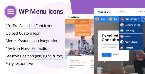
- WP Menu Icons
- Max Mega Menu
Here’s a quick reference table highlighting some commonly used menu icons along with their typical meanings:
| Icon | Description |
|---|---|
| 🛒 | Shopping Cart |
| 🔍 | Search |
| 📞 | Contact Us |
| 🏠 | Home |
Incorporating menu icons not only makes your site more user-friendly but also adds a layer of professionalism and polish that can set you apart from competitors. So, take a moment to evaluate your current navigation and consider how icons can elevate the user experience on your WordPress site.
Choosing the Right Icons for Your Site’s Aesthetic
When it comes to enhancing the visual appeal of your website, icons play a pivotal role in defining its overall aesthetic. Choosing the right icons is not just about aesthetics; it’s about creating a seamless user experience that aligns with your brand’s identity. Here are a few considerations to keep in mind:
- Consistency: Ensure that your icons maintain a consistent style throughout your site. Whether you opt for flat, outlined, or 3D icons, uniformity helps in creating a cohesive look.
- Color Palette: Choose icons that complement your site’s color scheme. Icons should blend well with your design elements, enhancing rather than distracting from your content.
- Clarity: Opt for icons that are easily recognizable. The purpose of icons is to convey information at a glance, so clarity is paramount. Avoid overly complex designs that may confuse users.
Another aspect to consider is the size and spacing of your icons. Icons should be proportionate to the text and other elements on your navigation bar. Too large, and they might overwhelm your content; too small, and they could be overlooked. A good rule of thumb is to keep icons around 16-24 pixels in height, adjusting as necessary based on your specific layout.
To illustrate the impact of icon choices, here’s a simple comparison table showcasing different icon styles and their best use cases:
| Icon Style | Best Uses |
|---|---|
| Flat Icons | Minimalistic design, tech blogs |
| Outlined Icons | Corporate websites, professional portfolios |
| 3D Icons | Creative industries, entertainment sites |
Lastly, be mindful of the accessibility of your icons. Use descriptive alt text and ensure that your icons are easily viewable on different devices and screen sizes. This not only improves user experience but also enhances your site’s SEO, making it more discoverable. Icons should not just look good; they should also serve a functional purpose, guiding users effortlessly through your site.
Step-by-Step Guide to Adding Icons to Your Navigation Menu
Adding icons to your navigation menu can significantly enhance the visual appeal and usability of your website. By following a straightforward process, you can make your menu more engaging and informative. Here’s how to do it, step by step.
First, you’ll need to select the icon set you want to use. Popular choices include:
- Font Awesome – A widely-used library that offers a vast array of icons.
- Dashicons – The official icon font of the WordPress admin interface.
- Material Icons – A set of icons from Google that follows the Material Design guidelines.
Once you’ve chosen your icon set, the next step is to add the icons to your navigation menu. This can be achieved through a few different methods:
- Using a Plugin: Plugins like Menu Icons by ThemeIsle make it incredibly easy to add icons without any coding.
- Custom HTML: If you’re comfortable with code, you can manually insert icon HTML into your menu items using the WordPress Customizer.
If you opt to manually add icons, here’s a simple example of how to do it:
To ensure your icons display correctly, you may need to enqueue the icon font in your theme’s functions.php file. Here’s a basic snippet to help you get started:
function enqueue_icons() {
    wp_enqueue_style('font-awesome', 'https://cdnjs.cloudflare.com/ajax/libs/font-awesome/5.15.4/css/all.min.css');
}
add_action('wp_enqueue_scripts', 'enqueue_icons');
don’t forget to style your navigation menu to perfectly integrate the icons. You can use CSS to adjust the spacing, color, and size of your icons. Here’s a simple CSS example:
.menu li a i {
    margin-right: 8px;
    color: #0073aa; /* WordPress blue */
}
With these steps, you’ll not only enhance the functionality of your navigation menu but also provide your users with a more intuitive and visually appealing experience. Happy customizing!
Exploring Popular Plugins for Menu Icons
- Menu Icons by ThemeIsle – This plugin allows you to easily add icons to your menu items. You can choose from a vast library of icons and customize them to fit your theme.
- Max Mega Menu – Known for its functionality, this plugin not only adds icons but also enables mega menu capabilities, improving navigation for large websites.
- WP Mega Menu – A drag-and-drop menu builder that supports icons, it provides a responsive design and various customization options to fit your branding.
Integrating icons into your navigation can enhance user experience significantly. Here’s a simple comparison of the features offered by these plugins:
| Plugin Name | Icon Library | Customizable | Mega Menu Support |
|---|---|---|---|
| Menu Icons by ThemeIsle | Yes | Yes | No |
| Max Mega Menu | Yes | Yes | Yes |
| WP Mega Menu | Yes | Yes | Yes |
Choosing the right plugin will depend on your specific needs. If you’re looking for a quick and straightforward way to add icons, Menu Icons by ThemeIsle is a great starting point. But if you want more advanced features like mega menus, then Max Mega Menu or WP Mega Menu would be your best bet. With just a few clicks, you can elevate your site’s aesthetic and functionality, making navigation not just easier, but also more enjoyable for your visitors.
Customizing Icons for a Unique User Experience
In today’s digital landscape, user experience is paramount, and customizing icons plays a significant role in achieving that goal. By incorporating unique icons into your WordPress navigation menu, you can enhance the visual appeal and functionality of your site. Icons can help guide users, making it easier for them to navigate your content while adding a touch of personality to your brand.
When selecting icons, consider the following elements to ensure they resonate with your audience:
- Relevance: Choose icons that represent the content they link to. For example, a shopping cart icon for an e-commerce section or a book icon for educational resources.
- Consistency: Maintain a uniform style across all icons. Whether you opt for flat design, line art, or 3D icons, consistency reinforces your brand identity.
- Visibility: Ensure that icons are easily recognizable. Avoid overly complex designs that could confuse users—simplicity is key.
To implement customized icons in your WordPress menu, follow these straightforward steps:
- Navigate to Appearance > Menus in your WordPress dashboard.
- Select the desired menu item and click on the drop-down arrow to reveal additional options.
- In the CSS Classes field, add a class for your icon (e.g.,
icon-homefor a home icon). - Save your changes, and then add corresponding CSS to style the icons.
Here’s a simple example of the CSS you might use to style your icons:
.menu .icon-home:before {
    content: 'f015'; /* FontAwesome home icon */
    font-family: 'FontAwesome';
    padding-right: 8px;
}
If you’re looking to use specific icon fonts, consider integrating libraries like Font Awesome or Material Icons. These resources provide a vast selection of icons that you can easily incorporate into your site. Just ensure you have the proper permissions and follow the guidelines for usage. Below is a quick reference table of popular icon libraries:
| Icon Library | Key Features | Usage |
|---|---|---|
| Font Awesome | Wide selection, customizable, supports SVG | CDN or local installation |
| Material Icons | Google’s design guidelines, versatile | CDN or local installation |
| Ionicons | Mobile-first, clean design | CDN or local installation |
By taking these steps, you can create a navigation experience that not only looks great but also enhances usability. Customized icons are not just decorative elements; they are essential tools that can lead users toward their desired actions with ease and clarity. Embrace the opportunity to express your brand’s unique identity through thoughtfully chosen icons, and watch how they elevate the overall navigation of your WordPress site.

Best Practices for Icon Placement and Size
Another important aspect is the alignment of icons in relation to text. Ideally, icons should be placed either to the left of or above the text, as this arrangement enhances readability and ensures that the icon complements the text rather than competing with it. When using horizontal menus, aligning icons to the left can lead to a smoother flow, while vertical menus can benefit from icons positioned above the corresponding text. Always test different layouts to see which resonates best with your audience!
| Icon Placement Options | Pros | Cons |
|---|---|---|
| Left of Text | Natural flow, easy to scan | Can be crowded in narrow spaces |
| Above Text | Clear separation, good for mobile | More vertical space needed |
| Inline with Text | Subtle integration | May reduce visibility |
Lastly, don’t underestimate the power of color and contrast. Icons should stand out against their backgrounds but also align with your site’s color scheme. Using the same color palette for icons as your branding can create a sense of uniformity, while contrasting colors can draw attention to specific actions or sections. Just make sure that the color choices are accessible; contrast ratios should meet WCAG guidelines to ensure readability for all users.

Enhancing Accessibility with Meaningful Icons
Icons serve as visual cues that enhance the user experience by making navigation intuitive and engaging. When used effectively, they can bridge the gap between aesthetics and functionality, allowing users to quickly grasp the purpose of each menu item. In WordPress, implementing meaningful icons in your navigation menu can significantly improve accessibility, ensuring that all users, regardless of their abilities, can navigate your site with ease.
To begin, consider the following benefits of incorporating icons into your WordPress menus:
- Visual Clarity: Icons can simplify complex information, making it easier for users to identify the function of each menu item at a glance.
- Enhanced User Engagement: A well-designed icon can capture attention and encourage interaction, leading to a more enjoyable browsing experience.
- Accessibility Compliance: By using universally recognized icons, you can cater to diverse user needs, including those with cognitive disabilities who may find text-heavy menus overwhelming.
When choosing icons, keep in mind the importance of relevance and familiarity. Icons should not only align with the content they represent but also be easily recognizable. For example, a magnifying glass for search, a house for home, or a envelope for contact can communicate their intended actions without confusion. Below is a simple table showcasing some common icons and their standard meanings:
| Icon | Meaning |
|---|---|
| 🔍 | Search |
| 🏠 | Home |
| 📧 | Contact |
| 📄 | About |
Incorporating these icons into your WordPress navigation menu can be a breeze with the right tools. Many themes offer built-in icon integration, and plugins like Font Awesome or SVG Support can enhance your options. By simply adding a class to your menu items, you can have visually appealing, functional icons that transform your navigation experience.
Ultimately, is not just about aesthetics; it’s about creating an inclusive environment for all users. By taking the time to thoughtfully integrate icons into your WordPress menus, you can foster a more user-friendly website that invites exploration and engagement. Remember, a small change like adding icons can lead to significant improvements in usability, making your site not only beautiful but also accessible to everyone.
Testing and Tweaking Your Menu Icons for Optimal Performance
Once you’ve added menu icons to your navigation in WordPress, the next step is to ensure they are performing optimally. Testing and tweaking these icons can significantly enhance user experience and engagement on your site. Here are some practical strategies to maximize the effectiveness of your menu icons:
- Monitor User Interaction: Use analytics tools to track how users are interacting with your icons. Are they clicking on them? Which icons are most popular? This data helps you understand what resonates with your audience.
- A/B Testing: Experiment with different icon designs, sizes, or placements. Create two versions of your menu and direct traffic to both. Analyze the results to see which version garners more clicks.
- Feedback Collection: Don’t shy away from asking your audience for their input. Simple surveys or feedback forms can provide invaluable insights into what users think about your menu icons.
When it comes to styling, consistency is key. Ensure that your icons align with your site’s overall aesthetic. Here are some tips on maintaining a cohesive look:
- Color Scheme: Use colors that complement your website’s theme. This not only makes your menu visually appealing but also strengthens brand recognition.
- Size and Spacing: Icons should be large enough to be noticeable but not overwhelm the text. Adjust spacing to ensure that the icons do not appear cluttered.
- Responsive Design: Make sure your icons look great on all devices. Test their appearance on mobile and tablet views, adjusting sizes accordingly.
If you’re still unsure about the effectiveness of your menu icons, consider utilizing a simple tracking mechanism, such as a table to compare the performance of different icons over time:
| Icon | Clicks | Conversion Rate |
|---|---|---|
| Home | 150 | 20% |
| About | 100 | 15% |
| Contact | 80 | 10% |
| Blog | 120 | 18% |
By regularly reviewing this data, you can identify which icons are performing well and which may need a redesign or repositioning. Continuous improvement is vital for keeping your navigation fresh and engaging, ensuring that your users have the best experience possible.
Troubleshooting Common Issues with Menu Icons
When adding menu icons in WordPress, you might encounter a few common issues that can disrupt your navigation experience. Here are some troubleshooting tips to help you resolve these problems effectively.
- Icon Not Displaying: One of the most frequent issues is when your menu icon fails to appear. Ensure that you have correctly added the icon class in your menu settings. Check for any typos in the class name, as even a small mistake can prevent the icon from rendering.
- Incorrect Icon Size: Sometimes, icons may appear too large or too small. This can usually be fixed by adjusting the CSS for your menu. Use the following snippet to modify the size:
| CSS Property | Example Value |
|---|---|
| font-size | 16px |
| line-height | 24px |
Another common issue is incorrect positioning. If your icons are misaligned, consider adjusting the margin or padding of your menu items. A simple CSS adjustment like this can often do the trick:
    .menu-item {
        margin-right: 10px;
    }
Lastly, if you’re experiencing a lack of responsiveness on mobile devices, ensure that your theme’s CSS is set up for mobile views. Utilize media queries to adjust icon sizes and spacing for smaller screens:
    @media (max-width: 768px) {
        .menu-item {
            font-size: 14px;
        }
    }
By addressing these common issues, you can enhance the functionality of your menu icons and improve the overall user experience on your WordPress site. Troubleshooting may take a bit of time, but the results will make your navigation visually appealing and functional.
Inspiring Examples: Websites that Nail Menu Icon Integration
2. Spotify – Spotify brilliantly employs icons in their navigation bar to attract users’ attention. Each icon corresponds to a specific function, such as playlists, search, or user profiles. The intuitive design ensures that even new users can easily navigate the app. Their use of color and shape provides an engaging visual language that complements their brand identity.
| Website | Menu Icons | Key Feature |
|---|---|---|
| Airbnb | Heart, Search | Simplified navigation |
| Spotify | Playlists, Search | Engaging visual language |
| Dropbox | File Icons | Clarity in functionality |
3. Dropbox – This cloud storage service uses icons effectively to represent various file types, making it easy for users to identify their documents at a glance. The icons blend seamlessly with the overall interface, providing clarity without overwhelming the user. It’s a perfect example of how functionality and aesthetics can work together.
4. Trello – Trello utilizes icons to enhance its project management tool. Each menu icon serves a distinct purpose, from adding cards to managing boards. The use of icons not only speeds up navigation but also supports a visually organized layout, making the user interface inviting and efficient.
By examining these websites, we can glean valuable insights into effective icon integration. They demonstrate how thoughtful design can elevate not just the look of your navigation but also the overall user experience. Whether you’re designing a blog or an e-commerce site, consider how these examples can inspire your own menu icon strategy.
Frequently Asked Questions (FAQ)
Q&A: Menu Icons in WordPress: How to Add Them to Your Navigation
Q1: Why should I consider adding menu icons to my WordPress navigation?
A1: Great question! Adding menu icons to your WordPress navigation can significantly enhance user experience. Icons provide a visual cue that helps visitors quickly identify sections of your site. They make your menu more engaging and can even improve navigation efficiency. Plus, a well-designed menu with icons looks professional and modern, which can boost your site’s credibility.
Q2: How do I add menu icons to my WordPress site? Is it complicated?
A2: Not at all! Adding menu icons is easier than you might think. You can achieve this using a variety of methods, such as using plugins or custom code. Plugins like “Menu Icons by ThemeIsle” offer user-friendly interfaces that allow you to pick icons from a vast library without touching any code. If you prefer a more hands-on approach, you can add custom HTML or CSS, but trust me, the plugin route is definitely the way to go for most users!
Q3: Are there specific plugins you recommend for adding menu icons?
A3: Absolutely! One of the top choices is the “Menu Icons by ThemeIsle” plugin. It’s simple, intuitive, and widely used. Another great option is the “WP Font Awesome” plugin if you’re looking for a broader range of icons. Both plugins allow you to customize your icons easily—selecting, resizing, and even changing colors to match your site’s aesthetic.
Q4: What types of icons should I use for my menu?
A4: When it comes to icons, keep it simple and relevant. Your icons should represent the corresponding menu item clearly. For example, use a house icon for the homepage, a shopping cart for the shop, or a phone for contact information. Consistency is key! Stick to a specific style or theme for your icons to maintain a cohesive look throughout your site.
Q5: Will adding menu icons slow down my website?
A5: Not if you choose wisely! Most well-coded plugins are optimized for performance, so you won’t notice any significant slowdowns. Just be sure to avoid using overly large icon files and keep your site optimized. Remember, a bit of extra flair can go a long way without sacrificing speed!
Q6: Can I customize the look of my menu icons?
A6: Definitely! Most plugins offer options for customization, such as changing icon size, colors, and spacing. If you’re comfortable with CSS, you can further tweak the appearance to match your theme perfectly. This flexibility allows you to create a navigation menu that not only functions well but also aligns with your brand identity.
Q7: What are some best practices for using menu icons?
A7: Great question! Here are a few best practices:
- Keep It Simple: Don’t overload your menu with icons—less is often more.
- Test for Clarity: Ensure that your icons are easily recognizable and relevant to the menu items.
- Mobile Responsiveness: Make sure your icons look good on all devices! Test them on mobile to ensure they’re not too small or too crowded.
- A/B Testing: Consider testing different icons to see which ones resonate best with your audience.
Q8: What’s the bottom line? Should I add menu icons to my WordPress navigation?
A8: Absolutely! Adding menu icons is a smart move that can elevate your website’s usability and aesthetic appeal. It’s a small change that can lead to increased engagement and a better overall experience for your visitors. So go ahead, give your navigation a little flair and watch your site shine!
Ready to get started? Dive into your WordPress dashboard and transform your navigation today!
The Conclusion
adding menu icons to your WordPress navigation is more than just a nice touch — it’s a powerful way to enhance user experience and make your website more intuitive. By following the simple steps outlined in this article, you can transform your navigation bar into a visually engaging and functional element that guides visitors effortlessly through your content.
Remember, first impressions matter, and when users see well-organized menus adorned with icons, they are more likely to stay, explore, and engage with your site. So why wait? Dive in, experiment with different icons, and let your creativity shine! Whether you’re looking to improve usability or just add a bit of flair, menu icons can make a significant difference.
Now that you’re equipped with the knowledge to elevate your site’s navigation, go ahead and make it happen! Your visitors will thank you, and your website will stand out in a crowded digital landscape. Happy customizing!
