
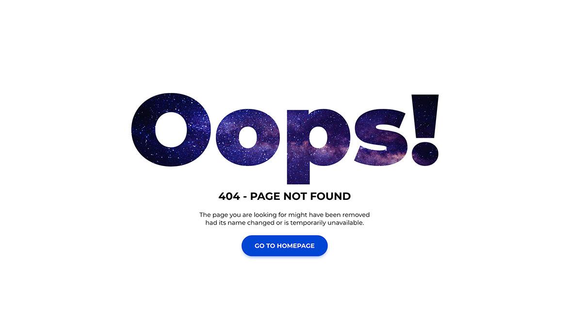
Introduction
We’ve all been there: you click a link, only to be greeted by an unhelpful and frustrating 404 error page. It’s like arriving at a party and finding out it’s been canceled—disappointing, right? But what if that experience could be transformed into something engaging and even enjoyable? Enter the world of creative 404 pages!
In this article, we’re diving into the 7 best 404 page examples that not only capture attention but also turn a potential dead-end into an opportunity. These pages do more than just tell you that something went wrong; they entertain, inform, and often guide you back on track. You’ll discover how the best practices employed by these websites can enhance user experience, reduce frustration, and even strengthen brand loyalty. So, whether you’re a web designer, a business owner, or simply someone curious about the art of digital engagement, stick around! Let’s explore how a little creativity can make a big difference when things go awry online.
Exploring the Importance of a Creative 404 Page
When users encounter a 404 error page, it can be a frustrating experience, often leading them to abandon your site altogether. However, a creative 404 page can transform this moment of confusion into an opportunity for engagement. By infusing some personality and humor, you can turn a potentially negative experience into a positive one. This is where the importance of a creative 404 page shines.
A well-designed 404 page serves as an unexpected touchpoint, allowing you to express your brand’s voice while guiding users back to relevant content. Here are a few key elements that can elevate the effectiveness of your 404 page:
- Clear Messaging: Ensure that users know they’ve hit a dead end. Use friendly language to explain the situation.
- Navigation Options: Provide links to popular pages, the homepage, or a search function to help users find what they’re looking for.
- Humor or Creativity: A clever design or witty message can lighten the mood and encourage users to stay on your site.
- Visual Appeal: Incorporate engaging graphics or animations that align with your brand’s aesthetics.
Moreover, a creative 404 page can enhance user experience by reducing frustration and fostering a sense of connection with your brand. It’s not just about recovery; it’s about making users feel heard. A simple, straightforward design can also provide reassurance and clarity during a moment of uncertainty.
To illustrate, consider incorporating elements like the following in your 404 page:
| Element | Purpose |
|---|---|
| Friendly error message | Informs users politely that the page is missing. |
| Search bar | Allows users to quickly find what they are looking for. |
| Links to popular content | Encourages users to explore other areas of the site. |
| Visual elements | Enhances engagement and aligns with branding. |
By thoughtfully crafting your 404 page, you not only mitigate the potential fallout from a lost page but also create a moment where your brand can shine. In the digital world, every interaction counts, and a creative 404 page is your chance to leave a lasting impression while keeping users engaged and wanting to explore more of what you offer.
Learn from the Best: Top 404 Page Examples that Stand Out
When users stumble upon a 404 page, it can feel like a dead end. However, the best 404 pages transform disappointment into engagement. Here are some stellar examples that not only save the day but also showcase creativity and cleverness.
First up, we have Airbnb, which takes a friendly approach by using a whimsical illustration of a lost-looking character. Their use of humor alleviates frustration, making users smile while encouraging them to continue exploring. Plus, they provide a search bar right on the page, making it easy for visitors to find what they’re looking for.
Another noteworthy example is GitHub. Their 404 page features an adorable octocat character that playfully acknowledges the error while offering users options to navigate back. Its simplicity ensures that users don’t feel overwhelmed, and the clear call-to-action buttons guide them back to safety.
Let’s not forget about Slack. Their 404 page is not just visually appealing; it embodies the brand’s fun personality. With a catchy tagline and a mix of vibrant colors, Slack transforms frustration into a light-hearted experience. Users are greeted with a funny message and a clear navigation path, ensuring they can find the right channel quickly.
Here’s a quick comparison of the standout elements from these 404 pages:
| Brand | Key Features | Unique Touch |
|---|---|---|
| Airbnb | Whimsical illustration, search bar | Friendly tone |
| GitHub | Playful character, clear navigation | Simplicity |
| Slack | Catchy tagline, vibrant colors | Brand personality |
Incorporating these elements into your own 404 page can significantly enhance user experience. Remember, the goal is to turn a navigational error into an opportunity for engagement. By embracing creativity and a touch of humor, you can ensure that users leave your site with a smile, ready to explore further.
How Humor Can Transform a Frustrating Experience
When users encounter a 404 error, the experience can be frustrating. However, a well-crafted 404 page, infused with humor, can turn that moment of irritation into a delightful encounter. By leveraging wit and creativity, web designers can not only inform users that something has gone wrong but also keep them engaged and entertained.
Here’s how humor can reshape a potentially negative user experience:
- Lightens the Mood: A funny message or a clever visual can lighten the mood, making users chuckle instead of fuming. For instance, a playful illustration or a witty pun can create a memorable impression.
- Encourages Exploration: Rather than leaving the site, users may be encouraged to explore other sections. A humorous 404 page can include links to popular content or suggested articles, sparking curiosity and engagement.
- Builds Brand Personality: Humor can humanize a brand, showcasing its personality and values. A playful tone can resonate with users, fostering a connection that could lead to future visits or conversions.
Some websites take this to the next level, crafting 404 pages that not only amuse but also invite users to stay. Here’s a quick comparison of some notable examples:
| Website | Humorous Element | Call to Action |
|---|---|---|
| GitHub | Funny octocat illustration | Link to explore GitHub’s features |
| Netflix | Playful movie references | Suggests trending shows |
| Blizzard | Punny character quotes | Redirects to games |
Ultimately, humor on a 404 page isn’t just about making people laugh; it’s about transforming a moment of disappointment into an opportunity for engagement. By offering users a light-hearted experience, brands can effectively guide them toward solutions while enhancing their overall perception of the website. In this way, a simple error page can become a powerful asset, illustrating that even in missteps, a brand can maintain its charm and keep users coming back for more.
Design Elements that Make a 404 Page Visually Appealing
When it comes to crafting a 404 page that resonates with users, visual appeal is crucial. A well-designed error page can turn a frustrating experience into a memorable one, helping to retain visitors rather than sending them away. Here are some key design elements that can elevate your 404 page:
- Eye-Catching Graphics: Incorporating engaging illustrations or animations not only draws attention but also adds personality. Consider using playful characters or whimsical designs that reflect your brand’s identity.
- Bold Typography: Choose fonts that stand out and are easy to read. A mix of bold headlines and quirky subtexts can convey the message clearly while keeping the tone light and friendly.
- Color Scheme: Utilize your brand colors strategically. A well-thought-out color palette can evoke emotions and create a visually cohesive experience. Bright colors can inject energy, while softer tones can be more calming.
In addition to graphics and color, incorporating interactive elements can enhance user engagement. Consider adding:
- Search Bar: Providing a search bar invites users to find what they were looking for quickly, keeping them on your site instead of abandoning it.
- Suggested Links: Including links to popular pages or your homepage gives visitors alternative pathways to explore, reducing frustration.
- Social Media Icons: Encourage users to connect with you on social platforms, transforming a negative experience into an opportunity for engagement.
To summarize the importance of design elements in a 404 page, here’s a concise table that highlights key aspects:
| Design Element | Purpose |
|---|---|
| Graphics | Captures attention and reflects brand identity |
| Typography | Ensures readability and conveys tone |
| Color Scheme | Evokes emotions and creates visual cohesion |
| Interactivity | Engages users and provides alternative navigation |
never underestimate the power of humor or creativity in your 404 design. A touch of wit or a clever message can transform an annoying experience into a delightful one. By combining these design elements thoughtfully, you can create a visually appealing 404 page that not only informs but also entertains and connects with your audience.

Guiding Users Back: Effective Navigation Strategies
When users encounter a 404 error page, it can be a frustrating experience. However, this moment presents a golden opportunity for websites to guide users back to the core of their offerings. Here are some effective strategies to ensure users find their way back seamlessly:
- Clear Branding: Reinforce your brand identity by incorporating your logo and brand colors. This familiarity can help users feel more connected, even in a moment of confusion.
- Simple Navigation: Provide a clear pathway back to your homepage or other key sections. Simplified navigation can prevent users from feeling lost and encourage them to continue exploring.
- Search Functionality: Including a search bar on the 404 page allows users to quickly find what they were looking for without additional clicks. Make sure it’s prominent and easy to use.
- Suggested Links: Offer a curated list of popular or related pages. This not only helps users rediscover content but also keeps them engaged with your site.
Another effective approach is to infuse a bit of personality into your 404 page. A touch of humor or a friendly tone can ease the frustration of a broken link. Consider using playful language or visually engaging elements like illustrations or animations that reflect your brand’s voice. This can turn a negative experience into a memorable one.
Moreover, consider implementing a feedback option where users can report the missing page. This not only engages your audience but also provides valuable insights into potential issues on your site, allowing for continuous improvement.
| Strategy | Benefits |
|---|---|
| Clear Branding | Reinforces familiarity and trust |
| Simple Navigation | Reduces frustration and aids exploration |
| Search Functionality | Empowers users to find content quickly |
| Sleek Design | Enhances user experience even in error |
Incorporating Brand Voice: Making Your 404 Page Unforgettable
When users encounter a 404 page, it’s often a frustrating experience. However, this moment can also be transformed into a memorable interaction by incorporating your brand voice. A well-crafted 404 page should reflect your brand’s personality, turning a negative experience into a delightful surprise. Here are key elements to consider:
- Humor: Infusing humor into your 404 page can lighten the mood. A clever pun or a witty remark can make users smile, reminding them that not everything on the internet is perfect.
- Consistency: Ensure that the tone, language, and visuals on your 404 page align with your overall brand identity. This consistency reinforces brand recognition and familiarity.
- Engaging Visuals: Use eye-catching graphics or animations that resonate with your brand. Whether it’s a quirky illustration or an animated character, visuals can convey your brand’s essence effectively.
- Helpful Navigation: While staying true to your brand voice, provide users with clear pathways to continue their journey. A well-structured menu or links to popular content can guide users back on track.
Consider the impact of storytelling on your 404 page. Share a brief, fun narrative about the lost page. This not only entertains users but also humanizes your brand. Use phrases that sound like you’re speaking directly to your visitors, creating a connection that can ease their frustration.
| Element | Example |
|---|---|
| Brand Voice | Playful and casual |
| Visuals | Cartoon character looking confused |
| Navigation | Links to homepage and popular articles |
Ultimately, your 404 page should invite users to stay and explore rather than just redirecting them to safety. Make them feel that they’ve stumbled upon a unique part of your brand universe. Encourage interaction, whether by inviting them to share their experience or explore related content. Embrace creativity and let your brand voice shine, making every error page an opportunity to connect with your audience.

Engagement Techniques that Keep Users Coming Back
Creating a memorable 404 page is not just about avoiding user frustration; it’s about transforming a potential dead-end into an opportunity for engagement. Here are some effective techniques that can turn a simple error page into a dynamic experience that keeps users returning:
- Personalized Messaging: Crafting a message that resonates with your audience can make a significant difference. Address them directly and inject a touch of humor or warmth to create an emotional connection.
- Interactive Elements: Incorporate engaging features like quizzes, polls, or games. This not only entertains but also invites users to interact with your brand in a light-hearted way.
- Visual Appeal: Use eye-catching graphics or animations to draw attention. Aesthetics play a crucial role in retaining interest, so ensure your design is not only functional but also visually striking.
Another essential aspect is providing clear navigation options. Make it easy for users to find their way back to relevant content. Consider implementing:
| Navigation Options | Purpose |
|---|---|
| Search Bar | Empower users to search for specific content directly, improving their experience. |
| Popular Links | Guide users to trending or important pages, keeping them engaged with your site. |
| Contact Support | Offer users a way to seek assistance, demonstrating your commitment to customer service. |
In addition, consider integrating social proof. Adding elements such as customer testimonials, ratings, or user-generated content can instill confidence and encourage visitors to explore further. They’ll be more likely to stay if they see others have had positive experiences with your brand.
Lastly, don’t overlook the power of storytelling. Share a brief narrative about your brand or a fun fact about your content. This can distract from the inconvenience of hitting a 404 page and foster a deeper connection, making users want to return and explore more of your offerings.
Analytics and Testing: Measuring the Success of Your 404 Page
Measuring the success of your 404 page is essential for understanding user behavior and improving overall site performance. By analyzing how visitors interact with your error page, you can identify what works and what doesn’t. This insight allows you to create a more effective user experience and potentially recover lost traffic.
Utilizing analytics tools like Google Analytics can provide valuable data on user interactions with your 404 page. Here are some key metrics to track:
- Page Views: Monitor how many visitors land on the 404 page to gauge the frequency of errors.
- Bounce Rate: A high bounce rate could indicate a poor user experience, suggesting that visitors aren’t finding what they need.
- Time on Page: Longer times spent on the 404 page may suggest users are engaged but struggling to find their way back.
- Exit Rate: Track how many users leave the site from the 404 page; a high exit rate might signal a need for improvement.
Additionally, implementing A/B testing on your 404 page can lead to significant optimizations. By comparing different versions of your 404 page, you can see which layout, messaging, or call-to-action resonates more with your audience. Here are a few elements to consider testing:
- Design Variations: Experiment with different visual styles to see what captures user attention.
- Copy Changes: Try various wording for your error message to find the most comforting and engaging tone.
- Navigation Options: Offer different pathways back to the main site or related content to determine the most effective recovery options.
To further simplify your analysis, consider creating a table to organize your findings and track the effectiveness of each variation:
| Version | Page Views | Bounce Rate | Time on Page | Exit Rate |
|---|---|---|---|---|
| Version A | 250 | 70% | 45 seconds | 60% |
| Version B | 300 | 50% | 1 minute | 40% |
By continuously measuring and testing your 404 page, you can ensure it’s not just a dead end, but a valuable component of your website that enhances user experience and drives engagement. Embrace analytics and A/B testing as vital tools in optimizing your 404 page to turn potential frustration into an opportunity for connection.
Final Thoughts: Crafting a 404 Page that Works for You
Creating a functional and engaging 404 page is not just about displaying a message; it’s an opportunity to connect with your visitors, guide them back to relevant content, and even inject some personality into your brand. A well-designed 404 page can transform a frustrating experience into a positive one. Here are some key elements to consider when crafting your own:
- Clear Messaging: Ensure that your visitors know they’ve landed on a 404 page. Use clear, straightforward language to inform them that the page they are looking for cannot be found.
- Helpful Navigation: Include links to important sections of your site, such as the homepage, popular articles, or product categories. This encourages users to explore rather than abandon your site.
- Creative Design: Use visuals, colors, and fonts that align with your brand. A touch of humor or creativity can also soften the blow of encountering an error.
- Search Functionality: Incorporating a search bar allows users to find what they’re looking for quickly, minimizing frustration and keeping them engaged.
- Contact Information: If users are still struggling, providing a way for them to reach out for help can enhance their experience and show that you care.
Consider A/B testing different versions of your 404 page to see which elements resonate best with your audience. You may find that certain designs or messaging styles lead to lower bounce rates and increased engagement. Monitor analytics to gauge how often users interact with your 404 page and adjust accordingly.
Ultimately, your 404 page should reflect the personality and values of your brand. By infusing it with creativity while ensuring it’s functional, you can turn a potential point of frustration into a chance for connection. Remember, every interaction on your site is a step toward building a meaningful relationship with your audience.
Here’s a quick reference table to sum up the best practices:
| Best Practice | Description |
|---|---|
| Clear Messaging | Inform users that the page is not found. |
| Helpful Navigation | Include links to important site sections. |
| Creative Design | Align visuals and tone with your brand. |
| Search Functionality | Allow users to search your site easily. |
| Contact Information | Provide a way for users to reach out for help. |
Frequently Asked Questions (FAQ)
Q&A: Exploring the 7 Best 404 Page Examples and Their Best Practices
Q1: What exactly is a 404 page, and why is it important?
A: A 404 page appears when users try to access a webpage that doesn’t exist. It’s crucial because it’s often the first interaction users have with your site when they hit a dead end. A well-designed 404 page can turn a frustrating experience into a delightful one, keeping users engaged rather than leaving them to bounce away.
Q2: What makes a 404 page effective?
A: An effective 404 page combines creativity, user-friendliness, and branding. It should clearly communicate the error, offer suggestions, and maintain the tone of your brand. The best ones often include humor, visuals, and a clear call to action that guides users back to useful content.
Q3: Can you highlight some of the best 404 page examples?
A: Absolutely! Here are a few standout examples:
- Zillow – They use witty humor and a friendly tone, engaging users with a light-hearted explanation of the error.
- Airbnb – Their page features stunning visuals and encourages users to explore other parts of the site, keeping them immersed in the brand.
- GitHub – Known for its playful design, GitHub’s 404 page incorporates their mascot, Octocat, making the experience fun and memorable.
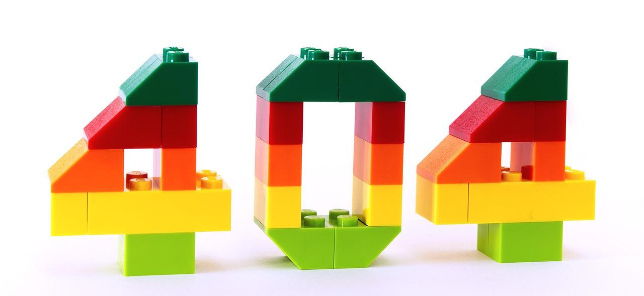
- LEGO – They embrace creativity with a charming design that appeals to both children and adults, inviting users back to adventure.
- Mailchimp – Their playful illustrations and clear navigation options maintain user interest and encourage exploration.
- Netflix – With a visually striking page, they provide suggestions for popular content, enticing users to stay and browse.
- Slack – Their 404 page is simple yet effective, featuring a clear message and a search bar to help users find what they need.
Q4: What best practices should website owners follow when designing their 404 pages?
A: Here are some key best practices:
- Keep it on-brand: Ensure the design and tone reflect your brand identity.
- Be informative: Clearly state that the page doesn’t exist and suggest alternative options.
- Add humor or creativity: A light-hearted approach can ease frustration and make the experience more enjoyable.
- Include navigation links: Provide links to popular pages or a search bar to help users find what they’re looking for.
- Use visuals: Engaging images or animations can capture attention and enhance the user experience.
- Highlight contact options: If users still need assistance, provide a way for them to reach out for help.
Q5: How can a great 404 page impact a website’s overall performance?
A: A compelling 404 page can significantly improve user experience, reduce bounce rates, and increase the chances of visitors exploring other parts of your site. By keeping users engaged, you boost the likelihood of conversions and create a positive impression of your brand. Remember, when users feel valued, they’re more likely to return!
Q6: What are some common mistakes to avoid when creating a 404 page?
A: Here are some pitfalls to steer clear of:
- Generic messages: Avoid dull, unhelpful messages that don’t provide solutions.
- No navigation options: Leaving users stranded without alternatives can lead to frustration.
- Overly complex designs: A cluttered or confusing layout can detract from the message and make navigation difficult.
- Neglecting mobile users: Ensure your 404 page is mobile-responsive, as many users access sites through their phones.
Q7: How often should I update my 404 page?
A: You should revisit and update your 404 page regularly, especially if you change your brand identity or website structure. Keeping the content fresh and relevant will help maintain a strong connection with your audience and reflect your commitment to user experience.
Conclusion:
Crafting a memorable 404 page is more than just a necessity; it’s an opportunity to engage users and showcase your brand’s personality. By learning from the best examples and implementing effective practices, you can transform what is often seen as a nuisance into a valuable part of the user journey. So, take the plunge and revamp your 404 page today—your users will thank you!
The Way Forward
As we wrap up our exploration of the 7 best 404 page examples and the best practices they employ, it’s clear that a well-crafted 404 page can transform a frustrating experience into a delightful one. Remember, a 404 error doesn’t have to spell doom for your website visitors. Instead, it can provide an opportunity to engage and guide them back to where they want to be.
Take a moment to review your own 404 page. Is it informative, engaging, and reflective of your brand? By implementing some of the strategies we discussed—whether it’s adding humor, useful links, or a search bar—you can not only salvage a lost visitor but also enhance your overall user experience.
So why wait? Start refining your 404 page today and turn those pesky errors into chances to build a stronger connection with your audience. After all, every page on your website, even the ones that lead to nowhere, plays a role in shaping your brand narrative. Happy optimizing!