

In today’s digital age, the design of your website is not just a matter of aesthetics; it’s a vital component of your online identity and brand strategy. Think about it: when visitors land on your site, what’s the first thing they notice? It’s not just your content—it’s the background, the font, and the overall vibe that pulls them in. These elements are like the clothes you wear; they convey a message about who you are and what you stand for. In an era where first impressions are formed in mere seconds, understanding the subtleties of background choices, font styles, and other aesthetic options can make all the difference between engaging your audience and losing them altogether. So, let’s dive into the essentials of web design that can transform your site from bland to brilliant, ensuring it resonates with your visitors and leaves a lasting impact. Whether you’re a seasoned designer or just starting out, this guide will equip you with the knowledge you need to make informed decisions and create a visually stunning website that truly reflects your brand.
Understanding the Impact of Background Choices on User Experience
When designing a website, the background choices you make can significantly influence how users perceive and interact with your content. A well-considered background not only enhances aesthetic appeal but also sets the tone for the entire user experience. Whether you choose solid colors, gradients, or images, each option brings its own psychological effects and usability considerations.
For instance, a light background can create an atmosphere of openness and cleanliness, ideal for blogs or e-commerce sites aiming for a modern look. Conversely, a dark background can evoke sophistication and depth, making it suitable for creative portfolios or high-end brands. Here are a few key aspects to consider:
- Contrast: Ensure text stands out against the background for readability.
- Emotion: Different colors elicit different feelings; choose colors that align with your brand message.
- Consistency: Maintain uniformity across all pages to create a cohesive look.
Font choices are equally crucial in shaping the visitor’s experience. The typography you select can convey authority, friendliness, or even a casual vibe, depending on the font style. Here are some tips to enhance your typographic choices:
- Readability: Opt for fonts that are easy to read on various devices.
- Hierarchy: Use different font sizes and weights to guide users through the content.
- Brand Voice: Select fonts that reflect your brand’s personality—formal, whimsical, or innovative.
Moreover, integrating aesthetic elements like icons, buttons, and images into your design can further enrich user engagement. Here’s a quick overview of how these elements can impact user experience:
| Element | Impact on Experience |
|---|---|
| Icons | Enhance navigation and understanding of actions. |
| Buttons | Guide user interactions, encouraging clicks and conversions. |
| Images | Create emotional connections and illustrate concepts. |
Ultimately, every aesthetic choice contributes holistically to the user experience. By thoughtfully selecting backgrounds, fonts, and additional visual elements, you create an environment that resonates with your audience, keeps them engaged, and enhances their overall interaction with your website.
Choosing the Right Font: More Than Just Aesthetic Appeal
When it comes to web design, choosing a font is not merely a matter of personal taste; it plays a crucial role in how your message is received. Fonts evoke emotions and set the tone for a website, so understanding the psychological impact of different typefaces can greatly enhance the user experience. A well-chosen font can convey professionalism, creativity, or friendliness, depending on your brand’s personality.
Consider the following factors when selecting a font for your website:
- Readability: Ensure that your font is easy to read across all devices. A complex or overly decorative font might look good in a logo but can frustrate users when reading body text.
- Brand Alignment: The font should reflect your brand identity. For a tech firm, a sleek, modern sans-serif might be suitable, while a boutique store may benefit from a more elegant script font.
- Hierarchy and Contrast: Use different fonts to establish a visual hierarchy. Combine a bold headline font with a lighter body font to guide the reader’s attention effectively.
Additionally, pay attention to font pairing. Mixing fonts can add depth to your design but requires a careful balance. Here are some tips for successful font pairings:
| Font Pairing | Use Case |
|---|---|
| Serif + Sans-serif | Classic and professional |
| Script + Sans-serif | Creative and inviting |
| Monospace + Serif | Techy and modern |
Ultimately, the right font choice can enhance user engagement and retention. When users find a website visually appealing and easy to read, they are more likely to stay longer and explore further. So, before you finalize your site design, take the time to experiment with various fonts and gather feedback. It’s an investment that pays off in user satisfaction and brand loyalty.
The Science Behind Color Schemes and Their Emotional Effect
When it comes to designing a website, the impact of color schemes cannot be overstated. Colors evoke emotions and can significantly influence the perception of your brand. For instance, warm colors like red and orange can create feelings of excitement and urgency, making them ideal for call-to-action buttons. In contrast, cool colors such as blue and green are often associated with tranquility and reliability, making them perfect for financial or health-related websites.
Understanding the psychology of color can guide you in selecting a palette that resonates with your target audience. Here are some common colors and their emotional associations:
| Color | Emotional Effect |
|---|---|
| Red | Passion, Energy |
| Blue | Calm, Trust |
| Green | Growth, Harmony |
| Yellow | Optimism, Cheerfulness |
Moreover, the choice of font can also play a crucial role in how visitors perceive your website. Serif fonts often convey tradition and reliability, making them suitable for formal or corporate sites. On the other hand, sans-serif fonts are modern and clean, which can appeal to younger audiences or tech-savvy users. Here’s how to effectively use fonts to your advantage:
- Consistency: Use a limited number of font styles to maintain a cohesive look.
- Readability: Ensure that your fonts are easy to read across various devices.
- Contrast: Pair bold fonts with softer styles to create visual interest without overwhelming the viewer.
Lastly, don’t underestimate the importance of your background choice. A simple, uncluttered background helps highlight your content, while a busy one can distract users. Opt for backgrounds that complement your color scheme and enhance your brand message. Consider using subtle textures or gradients to add depth without being overbearing. Remember, the right combination of colors, fonts, and backgrounds not only improves aesthetics but also boosts user engagement and conversion rates.
Creating a Cohesive Visual Identity with Consistent Aesthetic Elements
When it comes to designing a website, the visual identity is the first impression users get, and it speaks volumes about your brand. To achieve a cohesive look, backgrounds, fonts, and other aesthetic elements must harmonize beautifully. This unity is not just about aesthetics; it’s about creating a memorable experience that reflects your brand’s values.
Backgrounds can either make or break your website’s appeal. The choice of background color or image should align with your brand’s personality. Consider the following:
- Color Psychology: Warm colors can evoke excitement, while cool colors may promote calmness.
- Texture: Subtle textures can add depth without overwhelming the content.
- Responsiveness: Ensure backgrounds look good on all devices, enhancing user experience.
Equally important is the selection of fonts. The typography you choose not only affects readability but also conveys the tone of your message. Here are some tips to consider when selecting fonts:
- Pairing Fonts: Use complementary fonts for headings and body text to create a visual hierarchy.
- Legibility: Ensure that all text is easily readable on various screen sizes.
- Brand Voice: Match font style with your brand’s voice—playful, serious, modern, or traditional.
In addition to backgrounds and fonts, other aesthetic elements like icons, buttons, and images contribute significantly to a website’s visual identity. Here’s a quick overview of how these elements can tie into your overall design:
| Element | Role | Tip |
|---|---|---|
| Icons | Enhance navigation and comprehension | Keep them simple and consistent |
| Buttons | Drive user action | Ensure they are visually distinct |
| Images | Tell a story and evoke emotions | Use high-quality, relevant visuals |
remember that achieving a cohesive visual identity is an ongoing process. Regularly evaluate your design choices to ensure they reflect your brand accurately and resonate with your audience. Investing time into these aesthetic elements will cultivate a professional and inviting online presence that keeps users coming back for more.

Responsive Design: Ensuring Your Aesthetics Shine on Any Device
In today’s digital landscape, the significance of responsive design cannot be overstated. As users access your website from a myriad of devices, from smartphones to tablets and desktop computers, ensuring that your site’s aesthetic remains consistent and appealing is essential. A well-executed responsive design not only enhances user experience but also reinforces your brand’s visual identity across platforms.
When considering background options, it’s crucial to select designs and colors that not only resonate with your brand but also adapt seamlessly across different screen sizes. Here are a few points to keep in mind:
- Color Palette: Choose colors that align with your brand message. Ensure they are visually appealing on both light and dark backgrounds.
- Image Resolution: Use high-quality images that can scale without losing clarity. Consider using CSS to define background images that respond to screen size.
- Texture and Patterns: Subtle textures can add depth, but make sure they do not distract from your content.
Another key element in maintaining a polished appearance on all devices is your choice of fonts. Typography plays a pivotal role in user engagement. Here are essential tips for font selection:
- Readability: Opt for fonts that are easy to read on all devices, ensuring that sizes are appropriate for mobile and desktop views.
- Contrast: Ensure that your text has sufficient contrast against the background for accessibility and ease of reading.
- Consistent Branding: Use a limited number of fonts that reflect your brand personality, maintaining consistency throughout the site.
To further enhance your website’s aesthetic appeal, consider creating a simple responsive layout table that outlines how your design elements should adapt:
| Device Type | Background Style | Font Size | Image Scaling |
|---|---|---|---|
| Smartphone | Solid Color | 16px | Cover |
| Tablet | Gradient | 18px | Contain |
| Desktop | Background Image | 20px | Cover |
Ultimately, responsive design is not just about making a website functional on different devices but also about crafting a visually cohesive experience. By focusing on backgrounds, fonts, and other aesthetic elements, you can ensure that your website not only looks great but also fosters a connection with your audience, encouraging them to engage and explore.

The Role of White Space in Enhancing Readability and Focus
When it comes to web design, one of the most efficient tools at your disposal is white space. It might seem simple, but the strategic use of white space can dramatically enhance the readability of your content. By allowing elements to breathe, white space creates a clear visual hierarchy, guiding the reader’s eye across the page. This not only minimizes distractions but also encourages users to engage more deeply with the information presented.
Consider the following benefits of incorporating white space into your web design:
- Improved Focus: White space draws attention to the most important parts of your content, making it easier for users to identify key messages.
- Enhanced Aesthetics: A clean, uncluttered layout is visually appealing and can elevate the overall perception of your brand.
- Increased Comprehension: By reducing cognitive load, white space helps users process information more efficiently.
- Better Navigation: Adequate spacing between elements allows users to navigate your site intuitively, reducing frustration.
To effectively incorporate white space, think about the layout of your text, images, and buttons. For instance, instead of cramming text into narrow columns, allow for wider margins and line spacing. This makes reading less strenuous and keeps visitors engaged longer. A well-organized layout can be achieved by balancing text-heavy sections with images or graphics that utilize white space effectively, creating a harmonious flow.
Another practical tip is to use white space strategically around call-to-action buttons. This fosters an inviting atmosphere, urging users to click without feeling overwhelmed. The right amount of space can transform a simple button into a focal point, increasing the likelihood of user interaction. Remember, the goal is to create a seamless experience that feels effortless for the user.
In addition to enhancing usability, white space plays a crucial role in branding. A website that uses white space thoughtfully reflects a sense of professionalism and sophistication. In contrast, cluttered designs can convey disorganization and confusion. By investing time in analyzing how you use white space, you can create a website that not only looks great but also communicates your brand’s message effectively.
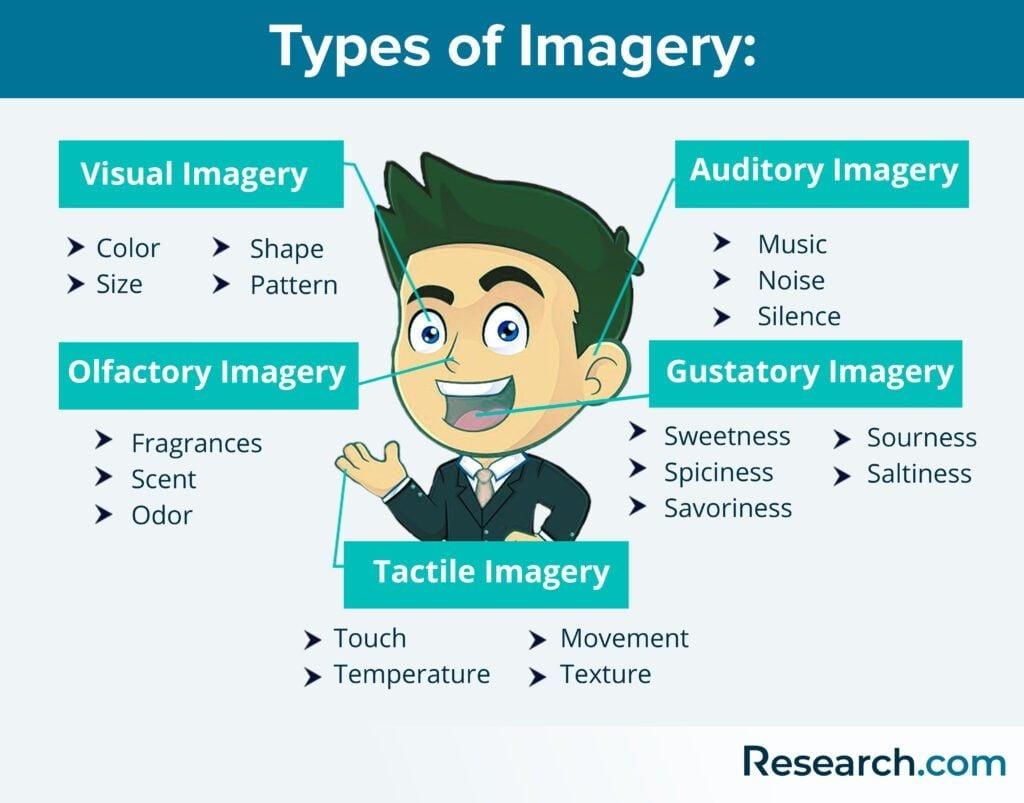
Incorporating Imagery and Graphics: Balancing Beauty and Function
When it comes to web design, striking the right balance between aesthetics and functionality is crucial. Imagery and graphics are not just eye candy; they serve essential roles in user engagement and information dissemination. Whether it’s a stunning hero image or a thoughtfully crafted infographic, visual elements can elevate the overall experience of your website.
To achieve this balance, consider the following essential aspects:
- Purposeful Imagery: Each image should serve a purpose, whether to enhance understanding of content or to evoke an emotional response. Avoid using visuals just for decoration.
- Consistent Style: Choose a consistent style for graphics that aligns with your brand identity. This could range from minimalist illustrations to vibrant photographs.
- Responsive Design: Ensure that images scale correctly on different devices. A beautiful image on desktop should not lose its allure on mobile.
Graphics can also enhance functionality. Infographics, for example, can simplify complex information into digestible visuals, making it easier for users to grasp key points at a glance. A well-designed chart can provide clarity that text alone might fail to achieve.
As you consider your design choices, think about using a table to visualize comparisons of imagery options:
| Image Type | Pros | Cons |
|---|---|---|
| Photographs | High emotional impact, relatable | Can be heavy to load, less original |
| Illustrations | Unique, customizable | May lack realism, can be misinterpreted |
| Icons | Clear communication, space-saving | Can be overused, may require explanation |
Ultimately, the imagery and graphics you select should work cohesively with your website’s layout and typography. Remember, the goal is not only to attract visitors but to guide them seamlessly through their journey on your site. By choosing visuals that reinforce your message and enhance user experience, you’re setting the stage for a successful online presence.

Accessibility Matters: Designing for All Users
When designing a website, every detail counts—especially when it comes to background and font choices. A well-thought-out design not only enhances the aesthetic appeal but also significantly improves usability for a diverse audience. Accessibility should be at the forefront of your design process, ensuring that all users, regardless of their abilities, can navigate and engage with your content effortlessly.
Background Colors: The choice of background color can either facilitate or hinder readability. It’s crucial to select colors that create a strong contrast with the text. Here are some tips to consider:
- Use light backgrounds with dark text or vice versa for better visibility.
- Avoid bright, flashy colors that may cause strain on the eyes.
- Consider users with color vision deficiencies; tools like color contrast checkers can be invaluable.
Font Selection: The typeface you choose is equally important. A clean and legible font can make all the difference. Focus on these aspects:
- Opt for sans-serif fonts for body text; they are generally easier to read on screens.
- Ensure that font sizes are adjustable to accommodate users with visual impairments.
- Avoid using more than two font types to maintain visual consistency and clarity.
Another often-overlooked element is the spacing between lines and letters. Proper spacing can enhance readability significantly. Consider implementing the following practices:
| Element | Recommendation |
|---|---|
| Line Height | 1.5 to 1.6 times the font size |
| Letter Spacing | 0.05em to 0.1em for improved clarity |
always remember that aesthetic choices should align with functionality. Engaging visuals draw users in, but if they cannot easily read or interact with your content, the design falls short. Implementing accessible design practices not only broadens your audience but also fosters an inclusive environment that welcomes everyone. By prioritizing accessibility, you’re not just following best practices; you’re creating a positive user experience that resonates with all visitors.

Trendy vs. Timeless: Making Smart Aesthetic Decisions for Longevity
When it comes to designing a website, the choice of background, font, and other aesthetic elements can significantly influence user experience and brand perception. Opting for a timeless design over fleeting trends can ensure your website remains relevant and appealing over the years. Here are some key considerations to keep in mind:
- Background Choices: A well-chosen background sets the mood for your website. Consider using muted colors or subtle textures that provide depth without overwhelming the content.
- Font Selection: Stick to classic typefaces. Fonts like Helvetica or Georgia often stand the test of time and maintain readability across devices.
- Consistency is Key: Ensure that your background and fonts complement each other. This creates a unified visual experience that reinforces your brand identity.
While trends can be tempting, they often lead to rapid obsolescence. For example, bold color schemes or overly decorative fonts can quickly become outdated. Instead, consider the following aspects to create a visually appealing website that endures:
| Element | Trendy Approach | Timeless Approach |
|---|---|---|
| Background | Bright gradients | Solid, neutral colors |
| Font | Decorative scripts | Sans-serif and serif combinations |
| Layout | Asymmetrical designs | Grid-based layouts |
Choosing a timeless aesthetic is about making smart decisions that enhance usability and engagement. Prioritize clarity and simplicity, and your website will not only attract visitors but also keep them coming back. Remember, a well-crafted website speaks volumes about your brand’s reliability and professionalism.
Testing and Iterating: The Key to Finding Your Perfect Design Aesthetic
When it comes to establishing a cohesive design aesthetic for your website, the journey often requires experimentation and refinement. It’s not just about picking a background or a font that looks good; it’s about how these elements work together to convey your brand’s message. By testing different combinations and gathering feedback, you can zero in on the perfect blend that resonates with your audience.
Testing is your best friend in this process. Start by exploring various background options—consider colors, patterns, and images that align with your brand identity. Use tools like A/B testing to present different designs to segments of your audience. This way, you can determine which backgrounds garner more engagement or drive better conversions. Remember to keep your target audience in mind; what works for one demographic may not appeal to another.
- Solid Colors: Often versatile, these can evoke specific emotions.
- Patterns: Adding texture can help create depth and interest.
- Images: A striking image can tell your brand story instantly.
Next, let’s talk about fonts. Typography is a subtle yet powerful tool in your design arsenal. The right typeface can enhance readability and reflect your brand’s personality. Experiment with various font pairings by using online font libraries. As with backgrounds, consider how each font interacts with others and the overall design. Pay attention to factors such as size, weight, and line spacing, as these can significantly affect user experience.
| Font Type | Best Use | Examples |
|---|---|---|
| Serif | Formal or Traditional | Times New Roman, Georgia |
| Sans-serif | Modern and Clean | Arial, Helvetica |
| Display | Attention-Grabbing Titles | Impact, Lobster |
be open to iterating on your design. The first combination of background and font might not be the best fit for your brand. Gather feedback from users, analyze engagement metrics, and be prepared to make adjustments. Even subtle changes can lead to significant improvements. The goal is to create a design that not only captures attention but also aids in navigating your content seamlessly. With each iteration, you’re one step closer to achieving your ideal aesthetic.
Frequently Asked Questions (FAQ)
Q&A: The Need to Know About Background, Font, and Other Aesthetic Options When Designing a Website
Q1: Why are aesthetic choices like background and font so important in web design?
A: Aesthetic choices are crucial because they create the first impression of your website. Think of your website as a digital storefront—if it looks inviting and professional, visitors are more likely to stay and explore. A well-designed aesthetic fosters trust and communicates your brand’s personality, making it easier for users to connect with your content.
Q2: How does the background of a website influence user experience?
A: The background sets the tone for your website and can significantly influence the vibe it conveys. A clean, simple background can help visitors focus on your content, while overly busy or distracting backgrounds can detract from the message you’re trying to communicate. Choose colors or images that complement your brand and enhance readability, creating an enjoyable browsing experience.
Q3: What role does typography play in web design?
A: Typography is not just about choosing a pretty font—it’s about enhancing readability and conveying your brand’s voice. The right font can evoke emotions and guide users through your content. For instance, a modern sans-serif font can suggest a contemporary brand, while a classic serif might convey tradition and reliability. It’s essential to choose fonts that align with your brand identity and ensure that they’re legible across devices.
Q4: Are there specific color schemes that work best for certain types of websites?
A: Absolutely! Color psychology plays a vital role in web design. For example, blue often conveys trust and professionalism, making it a popular choice for corporate websites. On the other hand, vibrant colors like orange or yellow can evoke excitement and energy, ideal for creative industries. When selecting a color scheme, consider your target audience and the emotions you want to evoke.
Q5: How can I ensure my website is aesthetically pleasing across different devices?
A: Responsive design is key! Your website should look great on desktops, tablets, and smartphones. Use flexible layouts and media queries to adapt your design to different screen sizes. Test your aesthetics on various devices to ensure that backgrounds, fonts, and colors maintain their integrity and appeal. Consistency across platforms builds credibility and improves user experience.
Q6: What are some common mistakes to avoid when it comes to website aesthetics?
A: One common mistake is using too many fonts or colors, which can create a chaotic experience. Stick to a limited color palette and a maximum of two or three fonts to maintain cohesion. Additionally, avoid using background images that clash with your text, making it hard to read. Clarity and simplicity often lead to a more polished and professional appearance.
Q7: How can I keep my website design updated without losing its identity?
A: Regularly refreshing your website’s design is important to keep up with trends, but it’s vital to do so without altering your brand identity. Consider implementing small changes, like updating background images, tweaking color schemes, or experimenting with new typography. This way, you keep your website looking modern while remaining recognizable to your audience.
Q8: how can I start improving the aesthetic elements of my website today?
A: Start by assessing your current design—what works, and what doesn’t? Experiment with color palettes using online tools, explore typography options, and consider the overall user experience. Gather feedback from users to understand their perspectives. Remember, great design is an ongoing process, and making thoughtful aesthetic choices can dramatically improve your website’s effectiveness and appeal. So dive in, have fun, and let your creativity shine!
Wrapping Up
As we wrap up our exploration of the crucial elements that shape the aesthetic appeal of your website, it’s clear that the right background, font, and design choices can make or break user experience. Think of your website as the digital face of your brand; it’s the first impression visitors will have, and you want it to be a memorable one.
By investing time in selecting the perfect background, choosing fonts that resonate with your audience, and harmonizing these elements, you’re not just enhancing visual appeal—you’re crafting a welcoming space that communicates your brand’s message effectively. So, whether you’re building a blog, an online store, or a portfolio, remember that these aesthetic choices are not mere details; they’re essential components of your overall strategy.
Embrace the power of design, and let it reflect your unique voice. Don’t underestimate the impact of a well-thought-out aesthetic; it can foster connection, build trust, and ultimately drive success. Now, go ahead—take these insights and transform your website into a visually stunning and user-friendly experience that stands out in the crowded digital landscape!