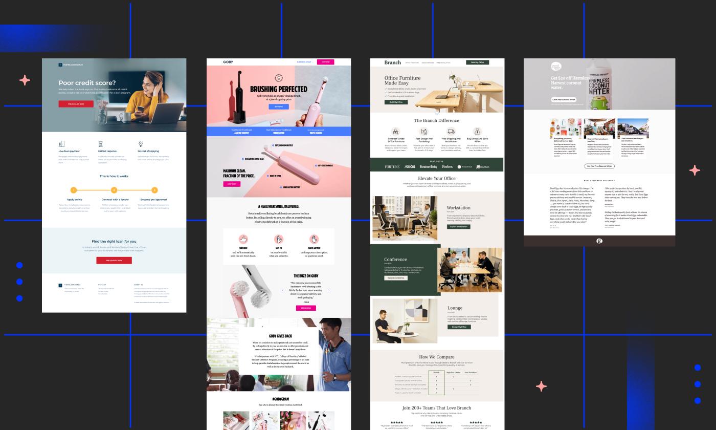
Are you ready to transform your ideas into a stunning landing page that captures attention and drives conversions? If the thought of designing a captivating webpage feels daunting, fear not! With Canva, it’s easier than you might think. Whether you’re promoting a product, collecting leads, or showcasing your portfolio, a well-designed landing page can make all the difference. In this article, we’ll walk you through five easy steps to create a landing page using Canva, making the entire process not only simple but also enjoyable. Say goodbye to complicated design software and hello to a user-friendly platform that puts creativity at your fingertips. Let’s dive in and unlock the potential of your online presence!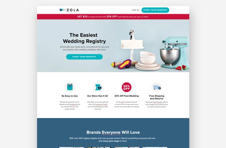
Creating a Compelling Vision for Your Landing Page
When it comes to designing your landing page, having a compelling vision is essential. Your landing page serves as the first touchpoint for potential customers, making it crucial to create an engaging experience that resonates with them. Start by identifying your target audience and understanding their needs, desires, and pain points. This foundational knowledge will guide your design choices and ensure that your message is tailored specifically to them.
Next, think about the core message you want to convey. This should be clear, concise, and focused on the value proposition of your product or service. Use powerful headlines that grab attention, along with supporting visuals that reinforce your message. Consistency in branding, including colors and fonts, will help establish trust and recognition. Consider the following elements to solidify your vision:
- Unique Selling Proposition (USP): What sets your offer apart from the competition?
- Emotional Connection: How can you evoke feelings that compel visitors to take action?
- Call-to-Action (CTA): What specific action do you want your visitors to take?
To visualize your ideas effectively, create a mood board using Canva. This tool allows you to combine images, colors, and typography that reflect your vision. These elements should harmonize to create a cohesive look and feel that resonates with your audience. You can also use Canva’s templates as a starting point, customizing them to align with your vision and brand identity.
Lastly, remember that an effective landing page is built on a balance of aesthetics and functionality. Ensure that navigation is intuitive, forms are simple, and the overall layout guides visitors toward your CTA. Utilize A/B testing to experiment with different versions of your landing page, allowing you to refine your vision based on real user data. This iterative process will not only help you create a more compelling landing page but also significantly improve your conversion rates.
Choosing the Right Template to Kickstart Your Design
When you’re ready to design your landing page, the right template can make all the difference. With Canva’s extensive library, finding a template that resonates with your brand and goals is easier than ever. Start by reflecting on your objectives—are you aiming to collect leads, promote a product, or share information? Identifying your primary goal will guide your choice.
Consider the following tips when browsing through templates:
- Brand Alignment: Choose a template that reflects your brand colors, fonts, and overall aesthetic. This creates a cohesive look that fosters trust with your audience.
- Layout Flexibility: Look for templates that allow for easy customization. You want the freedom to modify arrangements and include elements specific to your needs.
- Call-to-Action Placement: Prioritize templates that strategically position call-to-action buttons. This ensures your audience knows exactly what to do, whether it’s signing up or making a purchase.
Another aspect to consider is the type of content you plan to showcase. If your landing page will be heavy on visuals, opt for a template with ample image space. On the other hand, if you aim to convey detailed information, seek out designs that accommodate text effectively. In Canva, you can easily filter templates based on your preferred style, whether it’s minimalist, vibrant, or professional.
To help visualize your options, here’s a quick comparison of template types:
| Template Type | Best For | Features |
|---|---|---|
| Minimalist | Lead Generation | Clean lines, ample white space |
| Promotional | Product Launches | Bold graphics, attention-grabbing CTAs |
| Informational | Service Descriptions | Structured sections, detailed text areas |
Once you’ve narrowed down your options, don’t hesitate to preview how each template will look with your own content. Canva allows you to swap in images, edit text, and adjust colors easily, giving you a real sense of how your final product will appear. This step not only helps in solidifying your choice but also instills confidence in your design, ensuring it aligns with your vision before you hit publish.
Customizing Your Layout for Maximum Engagement
Creating a captivating layout is essential for keeping your visitors engaged and encouraging them to take action. When designing your landing page in Canva, consider these effective strategies to enhance your layout:
- Utilize White Space: Emphasizing white space can significantly improve readability and draw attention to key elements. Ensure that your text and images have room to breathe, making the page feel less cluttered.
- Incorporate Visual Hierarchy: Use size, color, and placement to establish a visual hierarchy that guides visitors through your content. Larger headlines should stand out, while secondary information can use a smaller font, creating a clear path for the eye to follow.
- Engaging Color Schemes: Choose color palettes that resonate with your brand and evoke the desired emotions. Consistent use of colors can lead to brand recognition while ensuring that important buttons or calls to action pop off the page.
Another important aspect of layout customization is the strategic placement of your content. Consider dividing your landing page into sections that flow logically. Here’s a simple way to visualize it:
| Section | Content Type | Purpose |
|---|---|---|
| Hero Section | Headline & Call to Action | Grab attention and encourage immediate action |
| Benefits Section | Bullet Points or Icons | Highlight key benefits of your offer |
| Testimonials | Quotes or Ratings | Build trust and credibility |
| Footer | Links & Contact Info | Provide additional navigation and support |
Don’t overlook the importance of mobile responsiveness as well. With a significant number of users accessing content via their smartphones, ensure that your layout adjusts seamlessly across devices. Test your design within Canva’s platform to see how it translates on smaller screens. Remember, a mobile-friendly layout can drastically boost engagement rates.
Lastly, always keep your target audience in mind. Tailor your layout to meet their preferences and behaviors. Use Canva’s extensive library of templates as a starting point, but feel free to customize them further to align with your brand’s voice and message. Engaging designs that reflect your audience’s interests will always lead to better results.

Crafting Eye-Catching Headlines That Grab Attention
In the vast ocean of online content, the first thing your audience encounters is the headline. It’s essentially the bait that can reel in potential visitors. A compelling headline makes a promise of value, piquing curiosity and encouraging clicks. Here are some strategies to ensure your headlines stand out:
- Use Numbers and Lists: Headlines with numbers are often more engaging. People love to know exactly what they’ll get, so phrases like “5 Easy Steps” can be very effective.
- Ask Questions: Questions provoke thought and invite readers to engage. For instance, “Are You Ready to Transform Your Landing Page?” can spark interest.
- Incorporate Strong Adjectives: Word choices like “Ultimate,” “Essential,” or “Unmissable” can convey urgency and importance, making your headline more appealing.
Consider also the emotional pull of your headlines. Every reader is searching for a solution or a spark of inspiration, so tapping into their feelings can create a connection. Use power words that convey urgency or excitement, compelling your audience to dive deeper into your content.
Another great way to boost headline effectiveness is through A/B testing. Try out different versions to see which resonates more with your audience. You can create variations that play with length, style, or tone. Over time, this practice will refine your ability to craft headlines that drive engagement.
ensure your headlines are not only catchy but also relevant to the content they represent. Misleading headlines may attract clicks initially, but they can lead to high bounce rates and a loss of trust. Make sure the promise made in your headline is fulfilled by the quality and substance of your content.
| Headline Type | Effectiveness |
|---|---|
| How-to Headlines | Highly effective for problem-solving |
| List Headlines | Encourages skimming and quick consumption |
| Question Headlines | Engages curiosity and prompts clicks |
Incorporating Visual Elements to Enhance Your Message
Visual elements play a crucial role in capturing attention and reinforcing your message, especially on a landing page where first impressions count. Using Canva, you can easily integrate various visual components to create an engaging and cohesive design. Consider incorporating high-quality images that align with your brand’s ethos. These images can evoke emotions, making your audience more likely to connect with your message.
Another effective strategy is to use infographics or icons to present information in a digestible format. Instead of long blocks of text, break down complex ideas into easily understandable visual bites. This not only makes your content visually appealing but also helps in retaining the audience’s attention longer. For example:
- Statistics: Use pie charts or bar graphs to illustrate key metrics.
- Steps: Create a flowchart to guide visitors through your process.
- Benefits: Highlight advantages with icon sets that are easy to scan.
Color schemes are another vital visual ingredient. Make sure to choose colors that complement each other and align with your brand identity. Canva offers a plethora of templates that provide a harmonious color palette, ensuring consistency throughout your landing page. Use contrasting colors for calls-to-action to make them stand out and encourage user interaction.
| Visual Element | Purpose | Tip |
|---|---|---|
| Images | Capture attention | Use images that evoke emotions |
| Infographics | Simplify complex data | Keep it concise and clear |
| Color Scheme | Enhance brand identity | Choose contrasting colors for CTAs |
Lastly, don’t forget about typography. The font you choose can significantly impact readability and the overall aesthetic of your landing page. Stick to two or three fonts to maintain consistency, using one for headings and another for body text. Make sure your text is legible against the background, as this will enhance user experience and decrease bounce rates.
Adding Effective Call-to-Action Buttons for Better Conversions
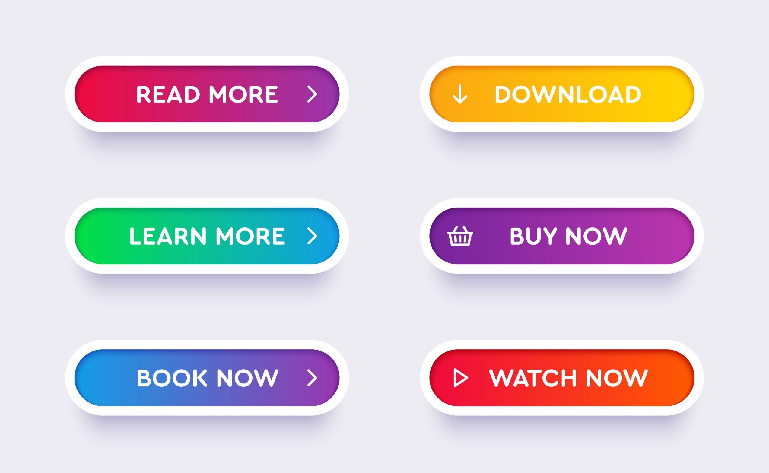
When it comes to driving conversions, your call-to-action (CTA) buttons play a crucial role. These buttons are the bridge between your audience and the desired action you want them to take. To enhance their effectiveness, consider these key elements:
- Clarity: Your CTAs should be clear and direct. Use action-oriented language that tells users exactly what to do, like “Download Now” or “Get Your Free Trial.”
- Visibility: Ensure your buttons stand out. Use contrasting colors that align with your brand but also grab attention. A well-placed button can significantly impact user engagement.
- Size Matters: The size of your CTA button should be large enough to be easily clickable on both desktop and mobile devices. A thumb-friendly size can lead to better interaction on mobile platforms.
Another effective strategy is to create a sense of urgency. Phrases like “Limited Time Offer” or “Join Now” can motivate users to act quickly. You can enhance this urgency by incorporating countdown timers or highlighting the scarcity of an offer. This psychological trigger can push hesitant visitors to make a decision.
Consider the placement of your CTAs as well. Typically, buttons should be strategically positioned at the top of the page, within the content, and at the bottom. This ensures that no matter where users are on your landing page, they have easy access to engage with your offer. Experimenting with different placements can help you determine what works best for your audience.
Lastly, don’t overlook the importance of testing your CTAs. Use A/B testing to compare different button texts, colors, and placements. This data-driven approach allows you to refine your strategy based on what resonates most with your visitors, ultimately leading to higher conversion rates.
| CTA Element | Best Practices |
|---|---|
| Text | Be Direct: Use actionable language. |
| Color | High Contrast: Make it pop! |
| Size | Thumb-Friendly: Ensure it’s clickable. |
| Placement | Strategic Positions: Top, middle, and bottom. |
| Testing | A/B Testing: Optimize based on data. |
Optimizing for Mobile to Reach a Wider Audience
When designing a landing page using Canva, ensuring that your layout is optimized for mobile is crucial. With a significant amount of web traffic coming from mobile devices, a seamless user experience can be the difference between gaining a new customer and losing one. Here are some essential tips to make your landing page mobile-friendly:
- Use Responsive Design: Canva allows you to create designs that adapt to different screen sizes. Ensure your elements are arranged in a way that they resize and reposition correctly on small screens.
- Prioritize Loading Speed: Optimize images and graphics to ensure fast loading times. Large files can lead to high bounce rates, especially on mobile networks.
- Simplify Navigation: Mobile users appreciate simplicity. Include clear calls to action and limit the number of clicks needed to complete a task.
- Test Across Devices: Before publishing, preview your landing page on multiple devices and browsers. This helps you identify any design flaws that could hinder user experience.
In addition to aesthetic adjustments, consider the technical aspects of your landing page. For example, using a mobile-friendly font size can significantly enhance readability. Text should be large enough to read without zooming in, and buttons should be easily clickable. A good rule of thumb is to ensure that your call-to-action buttons are at least 44 pixels tall, making them finger-friendly.
Moreover, incorporating a mobile-optimized form can capture leads effectively. Limit the number of fields to essential information and use dropdown menus or checkboxes where possible. This not only speeds up the process but also reduces friction for users on the go.
| Element | Mobile Best Practice |
|---|---|
| Images | Compress and optimize without losing quality |
| Text | Use a minimum size of 16px for readability |
| Buttons | Ensure buttons are at least 44px for easy tapping |
| Forms | Limit fields and use dropdowns/check boxes |
Remember, mobile optimization goes beyond just the design—it’s about creating an engaging experience that caters to the on-the-go user. By focusing on these key areas, you can ensure your landing page is not only visually appealing but also functional, thereby reaching a wider audience and maximizing conversions.
Integrating Your Brand Identity Seamlessly
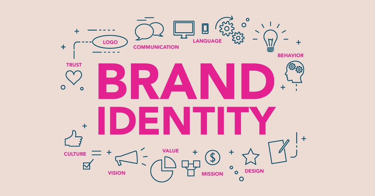
Creating a landing page that resonates with your audience starts with a robust brand identity. This means not just slapping your logo on the page but truly integrating the essence of what your brand stands for. To achieve this, focus on key elements that will make your landing page feel like an extension of your business.
First and foremost, utilize your brand’s color palette effectively. Choose colors that reflect your brand’s personality and evoke the right emotions. For instance, if your brand is energetic and youthful, vibrant colors can help convey that message. Here’s how to incorporate your color scheme seamlessly:
- Background Color: Use a color that aligns with your brand for the background.
- Call-to-Action Buttons: Make these stand out using a contrasting color that still fits within your palette.
- Text Color: Ensure readability while maintaining the aesthetic appeal.
Next, typography plays a crucial role in brand identity. Choose fonts that are not only visually appealing but also align with your brand’s voice. For example, a tech company might opt for modern, sans-serif fonts, while a luxury brand may favor elegant, serif styles. Remember to maintain consistency across headings, body text, and buttons to ensure a cohesive look.
Imagery is another powerful tool to reinforce your brand identity. Opt for images that reflect your brand’s ethos—whether that’s through professional photography, illustrations, or graphics. Make sure that any visuals are of high quality and relate directly to the message of your landing page. This will not only enhance the visual appeal but also provide context that resonates with potential customers.
To help you visualize this, consider the following table summarizing the key elements of integrating brand identity:
| Element | Tips |
|---|---|
| Color Scheme | Align with brand personality; use contrast for CTAs. |
| Typography | Choose fonts that reflect your voice; keep it consistent. |
| Imagery | Use high-quality visuals that relate to your brand’s message. |
Lastly, don’t forget to add your brand’s unique voice in the copy. Write in a tone that reflects who you are; whether it’s friendly, formal, or quirky, make sure it feels authentic. Consistency in messaging will not only build trust but also create a memorable experience for your audience. By following these guidelines, your landing page will not just attract clicks, but also leave a lasting impression that aligns with your brand identity.
Testing and Tweaking for Optimal Performance
Once your landing page is designed, the next step is to ensure it works effectively in driving conversions. Testing and tweaking are crucial phases that can significantly enhance your page’s performance. Here are some strategies to consider:
- A/B Testing: Create two versions of your landing page with slight variations. This could be a different headline, image, or call-to-action button. By analyzing which version performs better, you can make informed decisions to optimize your page.
- Analyze Visitor Behavior: Use tools like Google Analytics or heatmap software to understand how visitors interact with your page. Look for areas where users are dropping off or not engaging as expected, and adjust those elements accordingly.
- Optimize for Mobile: Ensure that your landing page is responsive and looks great on mobile devices. With a significant amount of traffic coming from smartphones, a mobile-friendly design can drastically increase your conversion rates.
Another essential aspect is to focus on loading speed. A slow-loading page can deter potential customers, leading to high bounce rates. Here’s how you can enhance your page speed:
| Optimization Technique | Description |
|---|---|
| Image Compression | Reduce file sizes without sacrificing quality to improve loading times. |
| Minify Code | Remove unnecessary characters from your HTML, CSS, and JavaScript files. |
| Use a Content Delivery Network (CDN) | Distribute your content globally to ensure faster access for users regardless of their location. |
Lastly, don’t underestimate the power of feedback. Share your landing page with trusted peers or potential users and ask for their opinions. Their insights can uncover issues you might not have noticed and provide fresh ideas for improvement. By implementing these strategies, your landing page will not only attract visitors but also convert them into loyal customers.
Launching Your Page and Monitoring Its Success
Once your landing page is ready to go, it’s time to hit the publish button and share your creation with the world. But simply launching your page isn’t the end of the journey; it’s just the beginning! Understanding how to monitor its performance is crucial for ensuring that your efforts translate into tangible results.
First, consider integrating analytics tools. Platforms like Google Analytics and Canva Analytics can provide invaluable insights into how visitors interact with your page. Look out for key metrics such as:
- Traffic sources: Where are your visitors coming from?
- Bounce rate: Are visitors leaving without engaging?
- Conversion rate: How many visitors are taking the desired action?
Understanding these metrics can help you make informed decisions. For example, if your bounce rate is high, it may indicate that your content isn’t resonating with visitors or that the design needs tweaking. A/B testing different elements (like headlines or images) can also provide clarity on what works best.
Next, don’t forget the power of feedback! Engaging with your audience through surveys or comments can provide qualitative insights that numbers alone can’t convey. Ask questions like:
- What did you like most about this page?
- Was there anything confusing or frustrating?
This kind of feedback invites your audience into the conversation and makes them feel valued, while also allowing you to refine your page further.
set specific goals for your page and monitor them consistently. Create a simple table to track your metrics over time:
| Date | Traffic | Conversions | Bounce Rate |
|---|---|---|---|
| Week 1 | 1500 | 150 | 45% |
| Week 2 | 1800 | 210 | 40% |
| Week 3 | 2000 | 300 | 35% |
By keeping an eye on these figures, you’ll not only see how your efforts are paying off but also identify areas for improvement. With each tweak and every piece of feedback, you can enhance your landing page, ensuring it continues to attract and convert visitors effectively!
Frequently Asked Questions (FAQ)
Q: What exactly is a landing page, and why do I need one?
A: Great question! A landing page is a standalone web page designed for a specific purpose—usually to capture leads or promote a product. It’s crucial because it can significantly boost your conversion rates. Think of it as your digital storefront. If you want to make a great first impression and drive action, you need a well-designed landing page!
Q: I’ve never designed anything before. Can I really create a landing page using Canva?
A: Absolutely, yes! Canva is incredibly user-friendly, and you don’t need to be a design expert to create something stunning. With its drag-and-drop interface and thousands of templates, you’ll find it’s easier than you think to produce a professional-looking landing page that reflects your brand.
Q: What are the five easy steps to create a landing page with Canva?
A: It’s simple! Here’s a quick rundown:
- Sign Up or Log In: First, get started by creating a free account or logging into your existing Canva account.
- Choose a Template: Explore the vast library of landing page templates. Pick one that resonates with your vision!
- Customize Your Design: Use Canva’s intuitive tools to edit text, images, and colors. Make it your own!
- Add Your Content: Write compelling copy, include call-to-action buttons, and ensure your offers are clear.
- Download and Share: Once you’re happy with your design, download it in a web-friendly format and start sharing it with your audience!
Q: Can I use my own images and branding on my landing page?
A: Absolutely! Canva allows you to upload your own images and logos, ensuring your landing page is perfectly aligned with your brand identity. Personal touches can significantly enhance the effectiveness of your page, so don’t hold back!
Q: How do I ensure my landing page converts visitors into leads?
A: Focus on a few key elements: a strong headline, persuasive copy, and a clear call to action (CTA). Use eye-catching visuals and keep your layout simple and uncluttered. Also, make sure to optimize for mobile devices—many visitors will likely be viewing your page on their phones!
Q: Is it really worth it to invest time in creating a landing page?
A: Definitely! A well-crafted landing page can drastically increase your conversion rates and enhance your marketing efforts. It’s an investment that pays off. By guiding visitors toward a specific action, you’re not just hoping for sales or sign-ups—you’re actively creating opportunities for growth.
Q: What if I need more help while using Canva?
A: No worries! Canva has a whole treasure trove of tutorials, tips, and a supportive community ready to help you out. You can also find plenty of online resources and forums where you can get advice and inspiration. You’re never alone on this journey!
Q: Ready to get started?
A: Absolutely! Your perfect landing page is just a few clicks away. Dive into Canva, unleash your creativity, and watch your ideas come to life! Trust us; you’ll be amazed at how easy and fun it can be. Happy designing!
In Conclusion
As we wrap up our journey through creating an eye-catching landing page with Canva, remember that the power to captivate your audience and drive conversions is now at your fingertips. With just five easy steps, you’ve unlocked the secrets to designing a professional-looking landing page that can elevate your brand and engage your visitors.
Now it’s time to put your newfound skills to the test! Dive into Canva, unleash your creativity, and watch as your ideas come to life. Don’t be afraid to experiment—after all, a little creativity can go a long way in making your landing page stand out from the crowd.
And remember, creating a successful landing page doesn’t end with the design. Keep testing, tweaking, and optimizing to ensure your page performs at its best. Your audience deserves the best, and with Canva, you have the tools to deliver just that.
So, what are you waiting for? Grab your laptop, head over to Canva, and start crafting a landing page that will not only attract attention but also convert visitors into loyal customers. Happy designing!

