
Introduction:
Welcome to the world of WordPress, where creativity meets functionality! If you’ve ever found yourself frustrated with how your content is displayed—perhaps your text is crammed together or your images aren’t flowing as they should—you’re not alone. A well-structured layout can make all the difference in engaging your audience and enhancing their experience on your site. One crucial aspect of achieving that perfect look is adjusting the column width in WordPress.
Don’t worry if you’re new to this! In this beginner’s guide, we’ll walk you through the simple steps to change column widths, ensuring that your content shines just the way you envision it. Whether you’re crafting a stunning blog post, showcasing a portfolio, or setting up an online store, knowing how to tweak those column widths can elevate your design and improve readability. So, let’s dive in and unlock the secrets to creating a visually appealing layout that keeps your visitors coming back for more!
Understanding Column Width in WordPress Basics
When working with WordPress, understanding how to adjust column width is essential for creating visually appealing layouts. Columns serve as the building blocks of your content, allowing you to organize text, images, and other elements in a way that enhances readability and engagement. Whether you’re designing a blog post, a landing page, or an online store, knowing how to manipulate column widths can significantly impact user experience.
WordPress offers several methods to change column width, depending on the theme and page builder you’re using. Most modern themes come equipped with customizable options, allowing you to set column widths directly through the WordPress Customizer or the page editor. If you’re using a page builder like Elementor or WPBakery, you can easily drag and adjust the column widths visually. Here are some common ways to adjust column width:
- Using the Block Editor: Select your column block, and in the settings menu, you can define the width in percentage or pixels.
- Custom CSS: Add custom styles in the Additional CSS section to override default widths. For example:
.my-custom-column { width: 50%; } - Page Builder Adjustments: Use the built-in controls in visual page builders to resize columns simply by dragging the edges.
Understanding the practicality of different column widths is also crucial. A wider column might be ideal for text-heavy content, while narrower columns can be beneficial for sidebars or additional information. Consider the following guidelines when deciding on column widths:
| Column Width | Best Use Case |
|---|---|
| 100% | Full-width layouts, images, or single-column text. |
| 50% | Two-column layouts for balanced text and images. |
| 33% | Three-column layouts, suitable for displaying multiple items. |
| 25% | Four-column layouts, great for galleries or product listings. |
Moreover, keep in mind that responsive design is vital in today’s mobile-first world. Always preview your columns on various devices to ensure they look great on screens of all sizes. Adjustments you make for larger screens should seamlessly transition to smaller ones without compromising functionality. Utilizing CSS media queries can help you achieve this, allowing you to set different column widths based on the viewer’s device.
don’t underestimate the power of whitespace around your columns. Proper spacing not only enhances aesthetics but also improves readability. A cluttered layout can overwhelm your visitors, while a well-spaced design invites them to interact with your content. Always aim for a balance that complements your column widths while providing a clean and digestible layout.
Why Column Width Matters for Your Website Design
When it comes to website design, the width of your columns plays a pivotal role in shaping user experience and readability. A well-structured layout can guide visitors seamlessly through your content, making it easier for them to find what they’re looking for. On the other hand, poorly sized columns can lead to frustration and high bounce rates. Think of your column widths as the framework of a house; if the foundation is not solid, the entire structure can crumble.
Consider the following factors when adjusting column widths:
- Readability: Text that is too wide can tire the eyes, while overly narrow columns can make it difficult to follow a line of text. Aim for a comfortable reading experience.
- Visual Hierarchy: Columns can be used to emphasize certain elements. Wider columns can draw attention to important information, while narrower ones can denote less critical content.
- Responsive Design: With mobile usage on the rise, it’s essential to adapt your column widths for various screen sizes. A flexible design ensures that your site looks great on any device.
To illustrate the impact of column widths, here’s a simple comparison of different layouts:
| Layout Type | Advantages | Disadvantages |
|---|---|---|
| Single Column | Focus on content, easy navigation | Can appear monotonous, less information at a glance |
| Two Columns | Balanced layout, good for text and visuals | Requires careful alignment, risk of clutter |
| Three Columns | Efficient use of space, varied content | Can overwhelm the viewer, difficult to maintain clarity |
Ultimately, choosing the right column width is about finding the perfect balance between aesthetics and functionality. Test different settings in WordPress to see how slight adjustments can dramatically enhance your overall design. Remember, your goal is to create a user-friendly environment that invites visitors to engage with your content.
So, next time you dive into your website design, don’t underestimate the importance of column widths. They are not just numbers; they are the backbone of a compelling user experience that can keep your audience coming back for more!
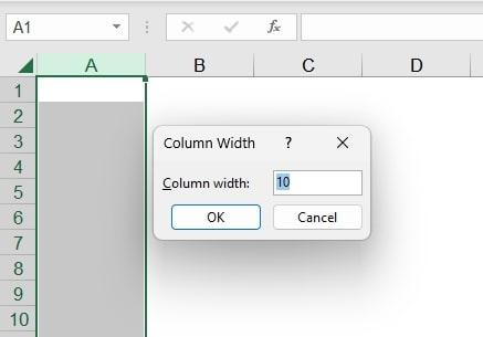
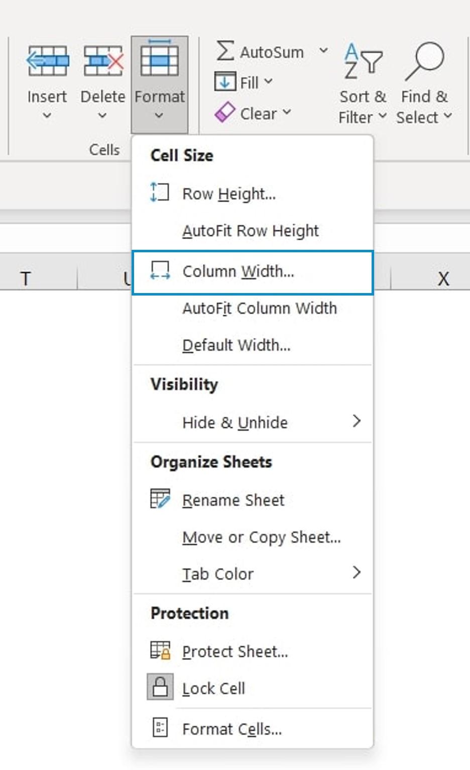
Exploring Different Methods to Change Column Width
Changing the column width in WordPress can dramatically enhance the layout of your content, making it more readable and visually appealing. There are several effective methods to achieve this, each with its own set of advantages. Let’s dive into some popular techniques that will allow you to customize your columns effortlessly.
The Gutenberg Block Editor is a powerful tool for adjusting column widths without needing any code. Here’s how to get started:
- Insert a Columns block within your post or page.
- Select the column you want to modify.
- In the block settings on the right, you can adjust the width percentages for each column.
This approach is user-friendly and allows you to see changes in real-time, ensuring your layout looks just as you envision.
For more advanced users, adding custom CSS can provide greater control over your column widths. By targeting specific classes, you can change the dimensions as needed. Here’s a simple example:
    .custom-column {
        width: 50%; / Adjust percentage as needed /
    }
Make sure to assign the custom-column class to your desired columns in the block editor. This method is particularly useful if you want a uniform look across multiple pages.
If you’re utilizing a page builder like Elementor or Beaver Builder, changing column widths becomes even more intuitive. Most page builders feature drag-and-drop interfaces that allow you to:
- Click and drag to resize columns directly.
- Set specific width percentages in the responsive settings.
This flexibility is fantastic for creating unique layouts that adapt beautifully across different devices.
| Method | Ease of Use | Customization Level |
|---|---|---|
| Block Editor | Easy | Moderate |
| Custom CSS | Advanced | High |
| Page Builder | Very Easy | High |
Each method offers distinct advantages, so consider your specific needs and technical comfort level. By experimenting with these techniques, you can find the perfect balance that enhances your WordPress site’s aesthetic and functionality.
Using the Block Editor to Adjust Column Width Effortlessly
Adjusting column widths in the WordPress Block Editor is not just simple; it’s a breeze! The intuitive drag-and-drop functionality allows you to create layouts that fit your content perfectly. By using the handles located between columns, you can effortlessly resize them to achieve a balance that enhances readability and visual appeal.
To get started, follow these steps:
- Open your page or post in the Block Editor and locate the columns you wish to adjust.
- Hover over the divider between the columns until you see the resize handle.
- Click and drag the handle to the left or right to increase or decrease the width of the columns.
One of the best features of the Block Editor is its ability to provide instant visual feedback. As you adjust the width, you can see how the content flows within the columns in real-time. This allows for a more dynamic approach to design, ensuring that your layout not only looks great but also functions properly across different devices.
For those who appreciate a little extra control, you can also set specific column widths directly from the block settings panel. Here’s how:
| Step | Action |
|---|---|
| 1 | Select the column block. |
| 2 | Go to the “Block” settings on the right. |
| 3 | Enter your desired width in percentage. |
This flexibility allows you to create unique layouts tailored to your site’s specific needs. For instance, if you want to highlight a particular section, you can create a wider column for images or text while keeping the supplementary information in a narrower column. The options are endless!
Experimenting with column widths can significantly boost the engagement level of your content. A well-structured layout not only captures attention but also guides your readers through the information seamlessly. So, don’t hesitate—play around with the column widths and discover the perfect balance for your next post!
Customizing Column Width with CSS for Greater Flexibility
Changing column widths in your WordPress site can dramatically enhance both functionality and aesthetics. By leveraging CSS, you can achieve a level of customization that allows your content to shine. This flexibility is crucial, especially when dealing with diverse content types such as images, text, and interactive elements.
To begin customizing your column widths, you need to target the specific CSS classes or IDs that apply to your columns. You can do this by inspecting your site’s elements using the developer tools in your browser. Once you’ve identified the right selectors, you can add your custom styles in the Additional CSS section of your WordPress Customizer. Here’s an example CSS snippet that showcases how to define widths for columns:
.column-class {
    width: 40%; /* Adjusts the column width */
    float: left; /* Ensures the columns sit side by side */
    padding: 10px; /* Adds space around the content */
}
In addition to fixed widths, consider using percentage values for even more responsive designs. This allows your columns to adjust fluidly based on the screen size. Here are some tips for better flexibility:
- Use Flexbox: Implement CSS Flexbox to create responsive column layouts that adapt smoothly to varying screen sizes.
- Media Queries: Utilize media queries to modify column widths for different devices, ensuring an optimal viewing experience.
- Custom Classes: Assign unique classes to specific columns if you need different widths for various sections of your site.
Here’s a simple example to illustrate how you might use a media query for responsive behavior:
@media (max-width: 768px) {
    .column-class {
        width: 100%; /* Stacks columns on smaller screens */
    }
}
If you prefer a more visual approach, using a WordPress plugin that offers a drag-and-drop editor can also help you customize column widths without diving into CSS. However, understanding CSS gives you the power to create unique designs tailored specifically to your brand’s needs.
Responsive Design: Ensuring Your Columns Look Great on All Devices
In today’s digital landscape, the importance of responsive design cannot be overstated. When it comes to WordPress, ensuring that your columns look great on all devices is essential for providing an optimal user experience. A responsive design adapts seamlessly to different screen sizes, making it crucial for keeping visitors engaged on mobile, tablet, or desktop.
Here are some effective strategies to ensure your columns maintain their appeal across devices:
- Utilize CSS Frameworks: Consider using frameworks like Bootstrap or Foundation. These frameworks offer built-in classes that make it easier to create responsive columns without extensive coding.
- Media Queries: Employ media queries in your CSS to adjust column widths based on the screen size. This allows for precise control over how your content appears on different devices.
- Flexible Units: Instead of fixed pixel widths, use percentages or viewport units (vw, vh) for your column widths. This enables columns to scale proportionately with the screen size.
To visualize how your columns will look on various devices, consider the following table that summarizes common breakpoints:
| Device Type | Breakpoint (px) | Recommended Column Width |
|---|---|---|
| Mobile | 0 – 767 | 100% |
| Tablet | 768 – 1024 | 50% |
| Desktop | 1025+ | 33.33% |
Another key aspect is the use of flexbox or grid layouts, which allow for more advanced arrangements of your columns. These modern CSS techniques make it easier to create complex layouts that adjust perfectly on any device. By leveraging these tools, you can ensure your website not only looks stunning but also functions flawlessly.
always remember to test your columns on real devices and emulators. This hands-on approach will help you spot any issues with alignment, spacing, or responsiveness. Regularly updating your design practices based on user feedback and analytics can also lead to continuous improvement in how your columns perform across devices.
Common Mistakes to Avoid When Adjusting Column Width
When adjusting column widths in WordPress, it’s easy to overlook certain details that can lead to a less-than-ideal outcome. Here are some common pitfalls to avoid that will help you achieve a professional and polished look for your website.
Ignoring Responsive Design
One of the biggest mistakes people make is not considering how their column widths will look on different devices. If your columns are too wide or too narrow, they may not display well on mobile devices, leading to a poor user experience. Always keep responsive design in mind by using relative units like percentages instead of fixed units like pixels. This approach ensures your content adapts seamlessly across various screen sizes.
Overcomplicating the Structure
Simplicity is key. When you try to create intricate layouts with too many columns, you risk making your content hard to read. Stick to a clean and straightforward column layout that enhances rather than distracts from your message. Here are some tips:
- Limit the number of columns.
- Use whitespace wisely to separate content.
- Maintain consistent column widths for a uniform look.
Neglecting Content Alignment
Another frequent mistake is not paying attention to how content aligns within your columns. Misalignment can make your website appear unprofessional and cluttered. Ensure that text and images are properly aligned. Consider using CSS classes to manage alignment effectively. For example:
| Alignment | Description |
|---|---|
| Left | Best for traditional text layouts. |
| Center | Great for headlines and calls to action. |
| Right | Useful for sidebars and images. |
Failing to Preview Changes
Always preview your changes before finalizing them. Skipping this step can lead to unintended visual consequences that could affect the overall design. Use the preview feature to see how your columns look in different scenarios, and make adjustments as necessary. This simple step can save you from making drastic edits later on.
By keeping these common mistakes in mind, you’ll ensure that your column adjustments enhance the design and functionality of your WordPress site, leading to a better experience for your visitors.

Tips for Testing and Fine-Tuning Your Column Layout
When it comes to perfecting your column layout in WordPress, testing and fine-tuning are essential steps that can significantly enhance the user experience on your site. Here are some tips to help you ensure your columns look great and function well.
Use the Preview Function
Before finalizing your column width changes, take advantage of the Preview feature in WordPress. This allows you to see how your adjustments will appear across different devices. Make sure to check:
- Desktop view
- Tablet view
- Mobile view
By doing so, you can ensure that your columns are visually appealing and functional, regardless of the screen size.
Adjust Based on Content
Keep in mind that the content you place in your columns plays a significant role in deciding their width. For instance, if you have text-heavy columns, consider adjusting the width to allow for better readability. Shorter paragraphs and plenty of white space can enhance the overall aesthetic. If you’re using images, ensure that they are appropriately sized to fit within the column without making your layout look cluttered.
Test for Responsiveness
Responsiveness is key in today’s mobile-first world. To test how your column layout behaves on different devices, use browser developer tools or online services like Responsive Test Tool. This will give you a clear picture of how your columns adapt to varying screen sizes, allowing you to make necessary adjustments to ensure a seamless experience for all users.
Gather Feedback
Sometimes, the best way to figure out if your column layout is effective is to ask for feedback. Share your website with friends, colleagues, or on social media, and encourage them to provide their thoughts on the column layout. You might uncover insights that you hadn’t considered before, leading to further refinements.
| Column Width | Content Type | Recommended Width |
|---|---|---|
| 50% | Text with Images | 40-60% for text, 40-60% for images |
| 33% | Multi-Column Text | 25-35% for each column |
| 100% | Full-Width Images | 100% for visual impact |
By carefully testing and fine-tuning your column layout based on these tips, you’ll not only create an aesthetically pleasing site but also one that delivers an excellent user experience. Happy designing!
Final Thoughts on Mastering Column Width in WordPress
Understanding how to effectively manage column width in your WordPress layout can significantly enhance your site’s visual appeal and user experience. With just a few tweaks, you can create a more organized and aesthetically pleasing structure that keeps your visitors engaged. By mastering this skill, you’ll not only improve readability but also highlight important content effectively.
Consider the following key points:
- Responsive Design: Always keep mobile users in mind. A fluid grid system ensures that your columns resize seamlessly on different devices.
- Content Prioritization: Use wider columns for critical information and narrower columns for supplemental content. This helps guide the reader’s focus.
- Balance is Key: Aim for a harmonious layout. Uneven column widths can make your content feel chaotic and uninviting.
When experimenting with column widths, don’t hesitate to utilize WordPress’s built-in tools, such as the block editor. The block editor allows for easy adjustments through drag-and-drop functionality, making it user-friendly even for beginners. Additionally, if you’re comfortable with custom CSS, you can apply specific width settings to customize your layout further.
| Column Width | Recommended Usage |
|---|---|
| 50% | Ideal for two-column layouts with equal emphasis on both sides. |
| 30% / 70% | Great for highlighting main content alongside a sidebar. |
| 100% | Best for full-width images or content that requires undivided attention. |
As you refine your skills in adjusting column widths, remember that practice makes perfect. Experiment with different layouts and seek feedback from friends or users to understand what works best for your audience. With time, you’ll develop an intuitive sense of what column configurations enhance your site’s overall impact.
Frequently Asked Questions (FAQ)
Q&A: How to Change Column Width in WordPress (Beginner’s Guide)
Q1: Why should I care about changing column width in WordPress?
A1: Great question! The width of your columns can significantly affect how your content is perceived. A well-structured layout improves readability, guides your visitors’ focus, and enhances the overall aesthetic of your site. By adjusting column widths, you can showcase your content in a way that keeps your audience engaged and encourages them to explore more.
Q2: Is changing column width in WordPress difficult?
A2: Not at all! Even if you’re a complete beginner, WordPress offers intuitive options that make adjusting column widths a breeze. Whether you’re using the block editor, page builders, or even custom CSS, you can achieve the look you want without needing to be a coding whiz. We’ve got you covered with easy steps to follow!
Q3: What tools do I need to change column widths?
A3: The good news is that you likely already have everything you need! If you’re using the WordPress block editor (Gutenberg), the built-in settings are perfect for making quick adjustments. If you prefer page builders like Elementor or Beaver Builder, they offer drag-and-drop features that make resizing columns incredibly simple. And for those who want to dive a bit deeper, a touch of custom CSS can give you complete control.
Q4: Can I change column widths without affecting the entire layout?
A4: Absolutely! One of the best things about WordPress is its flexibility. You can change the width of individual columns without impacting the rest of your layout. This allows you to create custom designs that highlight specific content, making your pages more dynamic and visually appealing.
Q5: What if I’m not happy with the changes I made?
A5: No worries! One of the most reassuring aspects of WordPress is that you can easily undo changes. Most page builders and even the block editor have an ‘undo’ option, and your changes can be saved as drafts until you’re completely satisfied. This means you can experiment freely without any fear of ruining your site.
Q6: Will changing column widths affect mobile users?
A6: Indeed, it’s essential to consider mobile responsiveness! Luckily, many WordPress themes and page builders automatically adjust column widths for mobile devices. It’s always a good practice to preview your changes on different screen sizes to ensure a seamless experience for all users. Trust us, your visitors will appreciate it!
Q7: Where can I find more resources on changing column widths?
A7: You’re in luck! There are countless tutorials, videos, and forums dedicated to WordPress design. Our article provides a step-by-step guide, but feel free to explore the WordPress support forums and community blogs. They’re treasure troves of tips and tricks that can help you master your website’s design.
Q8: How can I get started with changing column widths today?
A8: Easy! Just dive into your WordPress dashboard, pick a page or post, and start experimenting with the column settings in the block editor or your preferred page builder. Don’t hold back—play around with different widths and see what resonates with your vision. Remember, creating a visually appealing website is all about trying new things!
Changing column widths in WordPress doesn’t have to be intimidating. With the right guidance, you can transform your site’s layout and create an inviting experience for your visitors. So, are you ready to take your website to the next level? Let’s get started!
The Conclusion
And there you have it! Changing column widths in WordPress doesn’t have to be a daunting task, even if you’re just starting out. With the simple steps we’ve covered, you can easily customize your website’s layout to better showcase your content and enhance the user experience.
Remember, a well-structured layout not only looks professional but also keeps your visitors engaged. So why not take a few moments to tweak those column widths and see the difference it can make? Your website is your canvas—don’t be afraid to experiment and find what works best for you!
If you found this guide helpful, consider sharing it with fellow WordPress users who might be looking for a little design inspiration. And don’t forget to explore more tips and tricks to elevate your site even further. Happy blogging, and may your columns always be perfectly aligned!
Post navigation
Next Post