
The Only Elements You Need on a Contact Us Page
In the bustling digital landscape, your website serves as your brand’s storefront, and the “Contact Us” page is often its front desk. It’s the one place where potential customers transform curiosity into connection, making it a crucial element of your online presence. Yet, many businesses overlook the importance of this seemingly simple page, cluttering it with unnecessary information or, worse, leaving it bland and uninviting. But here’s the good news: you don’t need a complex design or an exhaustive list of contact methods to make an impact. In fact, a streamlined approach can enhance user experience, build trust, and ultimately drive conversions. So, what are the essential elements that turn a standard contact page into a powerful communication tool? Let’s dive in and explore the must-haves that will make your “Contact Us” page not just functional, but genuinely inviting.
The Essential Elements That Make Your Contact Us Page Shine
When designing a contact page, the goal is to create an inviting space for your visitors to reach out. Clarity is paramount; ensure that your contact information is easily identifiable. Use a clean layout that allows users to find your email, phone number, or address without any hassle. Bold headers and contrasting colors can help direct attention to these key details.
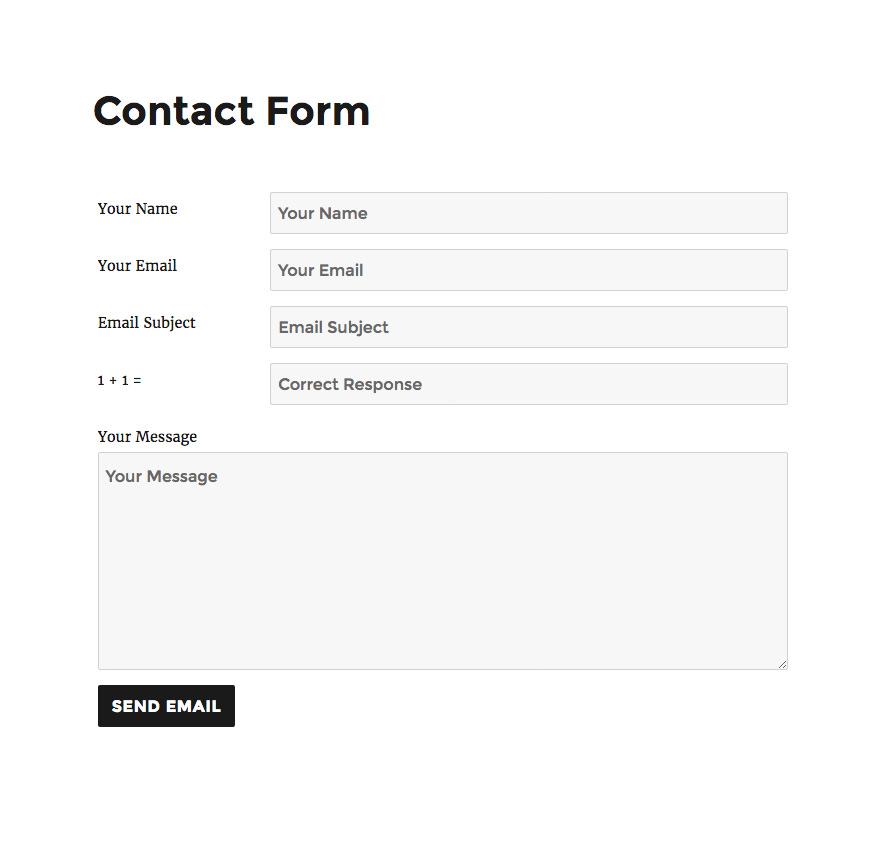
Incorporating a contact form is another vital element. This not only streamlines communication but also protects your email from spam. Make your form user-friendly by including only the essential fields such as:
- Name
- Email Address
- Message
Consider enabling a dropdown menu for inquiries to guide users to the right department, making it easier for you to respond effectively.
Don’t underestimate the power of social media links. Including icons that link to your profiles will allow visitors to connect with you on their preferred platforms. This not only enhances your brand’s presence but also offers an informal way for users to reach out. Ensure these links are visible and inviting, perhaps using a contrasting color palette that stands out.
A well-crafted call-to-action (CTA) can significantly boost user engagement. Encourage users to fill out the form or reach you directly. Phrases like “We’d love to hear from you!” or “Drop us a line and we’ll get back to you shortly!” create a welcoming atmosphere that encourages communication.
Lastly, consider adding a FAQ section. This can preemptively answer common queries and reduce the number of messages you receive. By addressing the most frequent questions, you save time for both your team and your visitors. Check out the table below for a quick view of FAQs you might consider including:
| Question | Answer |
|---|---|
| What are your business hours? | Monday to Friday, 9 AM to 5 PM. |
| Where are you located? | 123 Main St, Hometown, USA. |
| How long does a response take? | Typically within 24 hours. |
Creating an Inviting and User-Friendly Design
When designing a Contact Us page, the goal is to create an environment that encourages interaction and fosters trust. A well-thought-out design can turn an ordinary contact page into a vibrant communication hub. Start by ensuring that your page is visually appealing, balancing aesthetics with functionality. Use a clean layout with ample white space to prevent overwhelming visitors. Consider using contrasting colors for buttons and important text to draw the eye where it matters most.
Incorporating intuitive navigation elements is crucial. Make it easy for users to find the information they need. Here are some essential components to include:
- Clear Contact Information: Display your phone number, email, and physical address prominently.
- Contact Form: Utilize a simple form that asks for only essential information, such as name, email, and message.
- Social Media Links: Include icons that link to your social media profiles, allowing users to connect with you in a way they prefer.
Visual elements can also enhance user engagement. Consider adding appealing graphics or icons that relate to communication, such as speech bubbles or envelopes. Moreover, a friendly image of your team or office can humanize your brand, making visitors feel more connected. Don’t underestimate the power of user testimonials or trust signals—these can provide reassurance and encourage inquiries.
| Design Element | Purpose |
|---|---|
| Contact Form | Facilitates direct communication |
| Map Integration | Helps users locate your physical presence |
| FAQ Section | Addresses common queries proactively |
Lastly, remember that a responsive design is non-negotiable. Your Contact Us page should look great and function seamlessly on any device, from smartphones to desktops. Test your page across various devices to ensure that users have a consistent and enjoyable experience. By prioritizing user-friendly design, you can create a space where visitors feel valued and encouraged to reach out.
Crafting the Perfect Message for Your Audience
When creating a “Contact Us” page, it’s essential to consider who you are trying to reach and what information they might need. This page acts as a bridge between you and your audience, making it crucial to craft a message that resonates with their expectations and needs. Here are some key elements to include:
- Clear Call to Action: Encourage your visitors to take the next step. Whether it’s to fill out a form, send an email, or call you directly, be explicit about what you want them to do.
- User-Friendly Layout: Make it easy for your audience to find the information they need. A simple, clean design with intuitive navigation will keep frustration at bay.
- Multiple Contact Options: Offer various ways to get in touch. Consider including a phone number, email address, and even social media links to cater to different preferences.
- Personal Touch: A brief introduction or a friendly message can make a huge difference. It humanizes your brand and invites your audience to reach out.
Are you considering how to display contact information effectively? A table can help organize your content and make it visually appealing. Here’s a quick example of how you might structure your contact details:
| Contact Method | Details |
|---|---|
| Email: | [email protected] |
| Phone: | (123) 456-7890 |
| Office Hours: | Mon-Fri, 9 AM – 5 PM |
Lastly, remember to include a short FAQ section to preemptively answer common queries. This not only saves time for both parties but also shows that you understand your audience’s concerns. You can cover topics like response times, how to change an order, or any other relevant information that might help your visitors feel more informed and confident in reaching out.
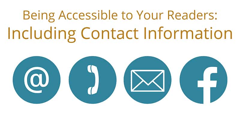
Key Information Your Visitors Expect to See
When your visitors land on your Contact Us page, they are looking for quick answers and easy ways to get in touch. A well-structured page can make all the difference in converting a casual visitor into a loyal customer. Make sure to incorporate the following essential elements:
- Contact Form: A simple and intuitive contact form allows users to reach out without needing to leave the page. Keep it concise—ask only for essential information like name, email, and message.
- Phone Number: For immediate support, provide a visible phone number. This shows that you value direct communication and are readily available to assist.
- Email Address: Include an email address for those who prefer written correspondence. Ensure it’s a professional one that represents your brand.
- Physical Address: If applicable, listing your physical address builds trust and legitimacy. It’s especially crucial for local businesses.
Furthermore, consider integrating a live chat option. This feature provides instant support, allowing visitors to get real-time answers to their questions. It not only enhances user experience but also increases the chances of a successful conversion.
Don’t forget about social media links! Adding icons that link to your social profiles fosters community and allows users to engage with your brand across different platforms. Make these icons prominent but not overwhelming.
| Contact Methods | Availability |
|---|---|
| Contact Form | 24/7 |
| Phone | 9 AM – 5 PM |
| 24/7 | |
| Live Chat | 9 AM – 9 PM |
Lastly, a FAQ section can preemptively answer common inquiries, reducing the volume of repetitive questions you receive. This not only saves you time but also empowers your visitors with the information they seek while they’re still on your page.
Why a Simple Form Beats Complicated Ones
When it comes to designing an effective contact form, simplicity is key. Users are more likely to engage with a straightforward, uncluttered interface than one riddled with complex fields and unnecessary distractions. A simple form not only enhances user experience but also increases the likelihood of conversions, as potential customers are less likely to abandon the process due to frustration.
Consider the essential elements that make up a successful contact form:
- Name: A simple text input for the user’s name fosters a personal touch.
- Email Address: Collecting an email is crucial for follow-ups, but don’t forget to make it easy to input.
- Message: Allow users to express their needs without limiting their thoughts with character counts.
Complicated forms often require unnecessary details, which can overwhelm users. For instance, asking for a phone number or address might seem beneficial, but it can deter them from completing the process. Instead, prioritize fields that are most relevant to your business needs. This approach not only streamlines communication but also builds trust as users feel their time is respected.
To illustrate the impact of simplicity versus complexity, consider the following table:
| Simple Form | Complicated Form |
|---|---|
| 3 Fields (Name, Email, Message) | 7 Fields (Name, Email, Phone, Address, Subject, Message, Preferred Contact Time) |
| Quick Submission | Time-Consuming Process |
| Higher Conversion Rates | Increased Abandonment |
With a simple approach, you encourage users to reach out without the intimidation of a lengthy process. Remember, each additional field is a potential barrier, so less is often more in the digital world. Focus on creating a seamless experience where users can communicate their needs effortlessly. This way, your contact form becomes a bridge to meaningful engagement rather than a hurdle they must overcome.
How to Optimize for Mobile Users
To truly enhance the user experience for mobile visitors, your Contact Us page should prioritize simplicity and accessibility. Start by ensuring that the layout is clean and intuitive, allowing users to find the information they need without unnecessary scrolling or navigation. A mobile-optimized page should be designed with touch interactions in mind, which means large buttons and links that are easy to tap.
Keep forms short and sweet. When asking users to fill out a contact form, limit the number of fields to the essentials. Here’s a quick checklist of what to include:
- Name
- Email Address
- Message
By minimizing the required information, you reduce the friction for mobile users, encouraging more submissions. You can also implement features like auto-fill to speed up the process even further.
Another crucial element is the inclusion of your business’s contact details, such as phone numbers and email addresses. Make sure these are clickable so that users can easily reach out with a single tap. Format them in a way that they stand out but don’t clutter the page. Consider using a table for clarity:
| Contact Method | Details |
|---|---|
| Phone | +1 (234) 567-890 |
| [email protected] |
consider adding a live chat feature or a chat bubble that floats on the page. This allows users to get immediate assistance without having to fill out a form or wait for an email reply. A prompt response can significantly enhance user satisfaction and potentially convert visitors into customers.
By implementing these strategies, you can create a Contact Us page that not only captures mobile users’ attention but also encourages engagement and builds trust. Remember, a seamless mobile experience can be the difference between a lost lead and a successful conversion.
Incorporating Trust Signals for Enhanced Credibility
When visitors land on your Contact Us page, they’re not just looking for a way to reach out; they’re also gauging the trustworthiness of your brand. To enhance credibility and foster confidence, it’s essential to incorporate trust signals that assure potential customers they are in safe hands. By implementing these elements, you not only encourage communication but also build a strong relationship with your audience.
One of the most effective trust signals is the presence of customer testimonials. Featuring real feedback from satisfied clients can significantly boost your credibility. Create a visually appealing section on your Contact Us page that showcases a few compelling testimonials. Consider including:
- Name and Profile Picture of the reviewer (with permission)
- Star Ratings to quickly convey their level of satisfaction
- Specific Comments that highlight your strengths
Another important aspect is displaying certifications and affiliations. If your business holds licenses, certifications, or is affiliated with reputable organizations, make sure these are visible. These badges or logos act as a visual reassurance that your business meets certain standards. Create a small table to display these elements effectively:
| Organization | Certification |
|---|---|
| Better Business Bureau | Accredited Business |
| Chamber of Commerce | Member |
| Local Health Department | Certified |
Don’t forget to include contact information that is easy to find and understand. A phone number, email address, and physical address can work wonders in establishing trust. Consider adding a live chat feature to enable real-time communication, which can further enhance the personal touch and credibility of your business. When people see multiple channels to connect with you, it alleviates their concerns and boosts their confidence in engaging with your brand.
Ultimately, the goal is to create an inviting atmosphere that makes potential customers feel comfortable reaching out. By thoughtfully integrating various trust signals into your Contact Us page, you not only enhance your brand’s credibility but also pave the way for stronger customer relationships and increased engagement.
The Power of Clear Call-to-Action Buttons
When it comes to guiding visitors through your Contact Us page, nothing is more crucial than having clear and compelling call-to-action (CTA) buttons. These buttons serve as the bridge between potential customers and your business, nudging them gently yet firmly towards taking the next step. A well-designed CTA not only catches the eye but also communicates the value of taking action, whether it’s filling out a form, sending an email, or making a phone call.
Consider the following elements that make an effective CTA:
- Clarity: Use direct and concise language that leaves no room for confusion. Phrases like “Get in Touch” or “Request a Callback” immediately inform users of what to expect.
- Contrast: Ensure that your buttons stand out visually from the rest of the page. Use contrasting colors that align with your brand but make the buttons pop.
- Placement: Position your CTAs strategically throughout the page. Placing them at both the top and bottom will cater to users who scroll down to find more information.
Moreover, creating a sense of urgency can encourage immediate action. Phrases like “Contact Us Today!” or “Limited Time Offer – Act Now!” can prompt visitors to think quickly. Pairing these phrases with a countdown timer or a special offer can amplify this effect.
Here’s a simple comparison table to illustrate potential CTA wording and their effectiveness:
| CTA Wording | Effectiveness |
|---|---|
| Contact Us | General response |
| Get a Free Quote | High engagement |
| Join Our Newsletter | Moderate interest |
| Request a Callback | Direct action |
don’t forget to test different versions of your CTAs through A/B testing. Small changes in wording, color, or placement can result in significant differences in conversion rates. By continually refining your approach based on data, you can harness the full potential of your Contact Us page to convert curiosity into meaningful interactions.
Using Chatbots to Enhance Customer Engagement
In today’s fast-paced digital landscape, chatbots have emerged as a powerful tool to bridge the gap between businesses and their customers. Using chatbots on your contact us page can significantly enhance customer engagement by providing instant responses and personalized interactions. They are available 24/7, ensuring that customers can reach out at any time without waiting for human assistance.
Imagine a visitor landing on your site with a question that needs immediate attention. With a chatbot, they can get instant replies, which not only improves their experience but also increases the likelihood of conversion. This immediacy creates a sense of connection and responsiveness, showcasing your brand as attentive and customer-centric.
Moreover, chatbots can guide users through complex inquiries by offering tailored suggestions based on their needs. By integrating AI-driven solutions, you can analyze visitor behavior to present relevant FAQs or support articles, preemptively answering common questions. This proactive engagement not only saves time for customers but also reduces the workload on your support team.
Consider the following features to optimize the chatbot experience:
- Customizable Greetings: Personalize the initial interaction with users to make them feel welcome.
- Multi-Channel Support: Ensure the chatbot can assist customers across various platforms, including social media and your website.
- Feedback Collection: Use the chatbot to gather customer insights and opinions to continually refine your service.
Here’s a simple comparison of traditional contact forms versus using chatbots:
| Element | Traditional Contact Forms | Chatbots |
|---|---|---|
| Response Time | Delayed (Hours or Days) | Instant |
| Availability | Business Hours Only | 24/7 |
| Personalization | Generic Response | Tailored Interaction |
By embracing chatbots, your contact us page transforms from a simple inquiry form into an interactive engagement platform. This not only enhances customer satisfaction but also reinforces your brand’s commitment to innovation and customer care. Don’t miss out on the opportunity to elevate your customer support and streamline interactions with this cutting-edge technology.
Regularly Updating Your Contact Information for Trustworthiness
Maintaining current and accurate contact information is crucial for building trust with your audience. When potential customers visit your website and find outdated phone numbers or email addresses, it can lead to frustration and doubt about your reliability. By ensuring your contact details are consistently updated, you demonstrate transparency and dedication to providing excellent customer service.
Here are some key reasons why having up-to-date contact information enhances your brand’s credibility:
- Professionalism: A well-maintained contact page reflects a professional image, showing that you care about your visitors’ experience.
- Accessibility: Clear and updated contact details make it easier for customers to reach out, fostering a sense of approachability and support.
- Trust Building: When users see that you actively manage your contact information, they are more likely to trust your brand and engage with your services.
It’s also wise to consider various channels of communication. Depending on your audience, they may prefer different methods to get in touch. Providing multiple options can enhance user experience. Here’s a simple table to illustrate effective communication channels:
| Communication Channel | Best For |
|---|---|
| Detailed inquiries and support | |
| Phone | Immediate assistance and personal touch |
| Live Chat | Quick questions and real-time support |
| Social Media | Engagement and community building |
Additionally, make it a habit to regularly review and verify your contact information. Setting reminders to check your contact page every few months can help ensure everything is current. This proactive approach not only prevents potential customer frustration but also enhances your overall brand image.
don’t forget to encourage feedback about your contact methods. A simple survey on your site can provide valuable insights into which channels your customers prefer. Such engagement demonstrates that you value their input and are committed to enhancing their experience. In the digital age, a few simple updates can make a significant difference in how your audience perceives your brand.
Frequently Asked Questions (FAQ)
Q&A: The Only Elements You Need on a Contact Us Page
Q: Why is a Contact Us page so important for a website?
A: A Contact Us page is like a handshake with your visitors. It’s your chance to build trust and encourage communication. Whether they have questions, feedback, or business inquiries, a well-designed Contact Us page can make it easy for them to connect with you. It’s essential for establishing credibility and inviting engagement!
Q: What are the must-have elements for an effective Contact Us page?
A: Great question! Here are the key elements you absolutely need:
- Clear Contact Information: Include your phone number, email address, and physical address if applicable. This transparency fosters trust.
- Contact Form: Make it easy for users to reach out by providing a straightforward contact form. Keep it simple—name, email, message—and avoid overwhelming visitors with too many fields.
- Social Media Links: Don’t forget to include links to your social media profiles. This not only gives users more ways to connect but also enhances your online presence.
- Business Hours: If you’re operating a business with specific hours, include them. This sets clear expectations for when they can reach you.
- FAQs Section: Anticipate common questions and provide answers. This can save time for both you and your visitors.
- Privacy Assurance: Let users know their information will be kept confidential. A brief statement about how you handle their data can ease concerns.
Q: How can I design my Contact Us page to attract more inquiries?
A: Design matters! Use a clean, user-friendly layout with a clear call-to-action (CTA). You want visitors to feel encouraged to reach out. Consider using engaging visuals or friendly language that reflects your brand’s personality. A visually appealing page can significantly boost interaction!
Q: What common mistakes should I avoid on my Contact Us page?
A: Avoid clutter! Too much information or complicated forms can drive users away. Also, steer clear of outdated contact information—nothing is more frustrating for a visitor than reaching out only to find the contact details are incorrect. Lastly, don’t forget to make your page mobile-friendly; many users will be accessing it on their phones.
Q: How often should I update my Contact Us page?
A: Ideally, you should review your Contact Us page regularly—every few months is a good rule of thumb. Check that all information is current, especially if your team, contact details, or business hours change. Keeping your page fresh ensures you’re always available to your audience.
Q: Can a well-optimized Contact Us page really make a difference?
A: Absolutely! A well-optimized Contact Us page can lead to increased inquiries, better customer engagement, and ultimately drive more conversions. It’s a vital part of your website that shouldn’t be overlooked. Think of it as a gateway for potential customers to enter your world!
a well-crafted Contact Us page is essential for fostering communication and building relationships with your audience. By incorporating these key elements and avoiding common pitfalls, you’ll create a welcoming space that encourages visitors to reach out and connect. So, what are you waiting for? Start refining your Contact Us page today!
To Wrap It Up
And there you have it—the essential elements that transform a standard “Contact Us” page into a powerful communication tool. By focusing on clarity, accessibility, and user engagement, you not only invite your visitors to reach out but also make them feel valued and heard. Remember, this page is often the first step in building a relationship with your audience, and a well-crafted contact page can work wonders for your brand’s credibility and trustworthiness.
So, take a moment to evaluate your current contact page. Are you making it as easy as possible for your visitors to connect with you? Are you providing all the necessary information without overwhelming them? If not, it’s time to make some changes.
Don’t underestimate the impact of a thoughtful contact page—it’s more than just a form; it’s your opportunity to engage with potential customers and show them that you’re ready to listen. Get started today, and watch how improved communication can lead to better relationships and greater success for your business. Let’s make it easy for your audience to get in touch!