
Navigating the Digital World: Your Essential Guide to Website Navigation Design
In today’s fast-paced digital landscape, where attention spans are shorter than ever, the way users navigate your website can make or break their experience. Imagine landing on a site and feeling instantly lost—frustrating, right? A well-designed navigation system not only helps guide visitors through your content but also keeps them engaged and coming back for more. In this article, we’ll reveal 10 indispensable website navigation design tips that can elevate your site’s usability and drive conversions. Plus, we’ll highlight 5 common pitfalls to avoid, ensuring that your users have a seamless journey from start to finish. Whether you’re a seasoned web designer or just starting out, these insights will help you create a user-friendly experience that resonates with your audience. Let’s dive in and transform your website into a navigation powerhouse!
Crafting an Intuitive User Journey
Creating an intuitive user journey on your website is all about understanding your audience. When users arrive at your site, they should feel drawn in by a seamless flow of information and options, making it easy for them to find exactly what they need. To achieve this, consider implementing the following strategies:
- Prioritize Clarity: Ensure that your navigation labels are clear and descriptive. Users shouldn’t have to guess what a menu item means; intuitive labels enhance the likelihood of exploration.
- Logical Hierarchy: Organize your navigation in a way that reflects the user’s priorities. This typically means placing the most important pages at the top level, with subcategories easily accessible.
- Consistent Layout: Maintain a consistent layout throughout the website. Users should know where to find the navigation menu, search bar, and any other key elements on every page.
- Visual Cues: Use visual elements, like contrasting colors or icons, to guide users’ attention. Highlighting clickable items can make navigation more engaging and intuitive.
- Mobile Optimization: With an increasing number of users browsing on mobile devices, it’s crucial to ensure that your navigation is responsive. Dropdown menus, tap-friendly buttons, and easily accessible links are essential.
To further enhance the user journey, consider employing analytics tools to monitor user behavior. By examining where users tend to click and where they drop off, you can refine your navigation accordingly. A/B testing different layouts or menu structures can provide insights into what resonates best with your audience.
| User Behavior | Action |
|---|---|
| User clicks on a product category. | Highlight related products to encourage deeper exploration. |
| User leaves after visiting one page. | Consider simplifying navigation or adding recommended content. |
| User spends time on a specific service. | Feature testimonials or case studies to build trust and encourage action. |
Ultimately, an intuitive user journey not only enhances user satisfaction but also increases conversion rates. By prioritizing user-centric design and continually refining your approach based on feedback and analytics, you can create a website that feels natural and inviting. Make the navigation experience enjoyable, and your visitors will be more likely to return.
The Power of Clear Menu Structures
When users arrive at your website, they should feel as if they’ve stepped into a well-organized library rather than a chaotic storage room. A clear menu structure not only directs users efficiently but also enhances their overall experience. Clarity is key—when visitors can easily navigate your site, they are more likely to stay longer and engage with your content. This leads to increased conversions and a lower bounce rate.
To create a cohesive menu, consider the following elements:
- Logical Grouping: Organize menu items into categories that make sense. For instance, group related pages under a common heading to streamline user searches.
- Descriptive Labels: Use clear, descriptive labels that communicate exactly what users can expect when they click. Avoid jargon or vague terms that can confuse visitors.
- Consistent Layout: Maintain a uniform layout across all pages. This consistency helps users know where to find information without the need to relearn navigation.
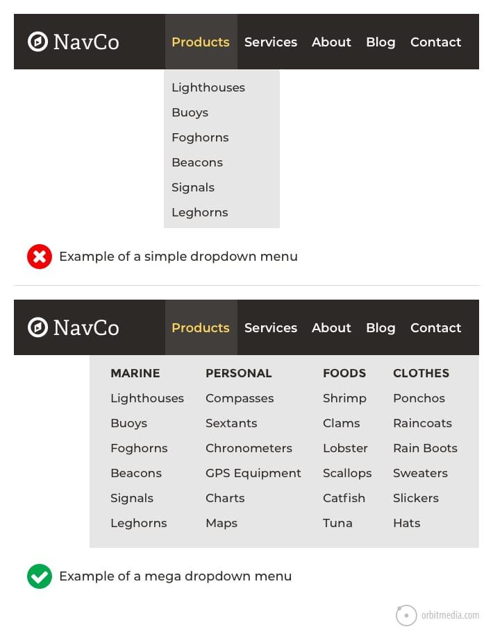
Consider employing a dropdown menu for sub-items. This allows users to see all their options without cluttering the primary navigation space. By minimizing visual overload, you provide a more pleasant browsing experience. Here’s an example of a well-structured dropdown:
| Main Menu Item | Submenu Options |
|---|---|
| Services | Web Design SEO Optimization Content Creation |
| About Us | Our Story Meet the Team Careers |
| Blog | Latest Posts Categories Archives |
Moreover, mobile optimization is crucial in today’s digital landscape. Ensure that your menu adapts seamlessly to various devices. A responsive design that collapses into a hamburger menu can significantly improve usability on smartphones and tablets. Users are likely to abandon sites where navigation is cumbersome on mobile.
a clear menu structure is not just a design choice; it’s a fundamental aspect of user experience. By investing time in creating a logical, descriptive, and mobile-friendly navigation system, you pave the way for users to discover everything your site has to offer with ease. Remember, happy visitors are loyal visitors!
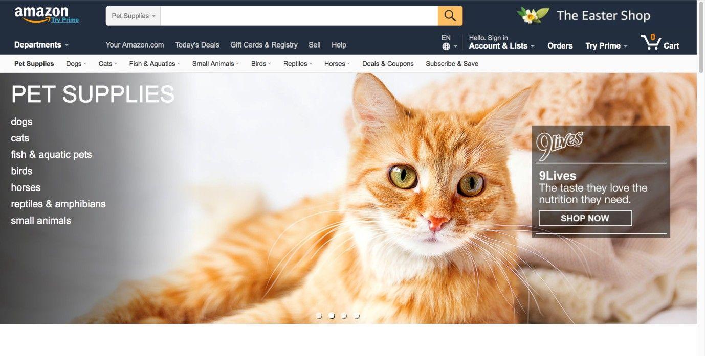
Prioritizing Mobile-Friendly Navigation
When it comes to website navigation, users on mobile devices have different expectations than those browsing on a desktop. isn’t just a trend; it’s essential for retaining visitors and enhancing their browsing experience. A well-designed mobile navigation system ensures that users can quickly find what they’re looking for without feeling overwhelmed or frustrated.
To make navigation intuitive on smaller screens, consider implementing a hamburger menu. This design compactly hides the navigation options until they’re needed, saving valuable screen space. However, don’t forget to make the menu easily recognizable. Pair it with clear labeling and consider using icons alongside text to enhance usability.
Another critical aspect of mobile navigation is touch-friendly design. Make sure that all clickable elements are large enough to tap easily. This reduces the chances of users accidentally clicking on the wrong link, which can lead to frustration and high bounce rates. As a guideline, aim for a minimum touch target size of 44×44 pixels.
Furthermore, prioritize the most important links at the top of your navigation. Users often look for key pages like Home, Contact, and Products first. Organizing your menu according to user needs can significantly enhance their experience. A simple way to visualize this is through a table that ranks navigation items based on user engagement:
| Navigation Item | User Engagement (%) |
|---|---|
| Home | 75% |
| Contact | 62% |
| Products | 58% |
| About Us | 45% |
don’t forget about the importance of search functionality. Including a search bar that is easily accessible on mobile can help users find specific content quickly, reducing the time they spend navigating through menus. This is particularly beneficial for content-heavy websites, where efficient navigation can significantly enhance user satisfaction.
Creating a Seamless Search Experience
When users visit your website, they often have a clear goal in mind: to find information quickly and efficiently. A well-structured search experience is essential in meeting these needs. Here are some strategies to enhance the search functionality on your site.
- Intuitive Search Bar Placement: Positioning your search bar prominently, such as at the top right corner of your site, ensures it’s easily accessible. Users shouldn’t have to hunt for it.
- Auto-Suggestions and Corrections: Implementing features that provide auto-suggestions or correct common typos can drastically reduce user frustration and improve search results.
- Filters and Sorting Options: Allow users to refine their search results with filters. This helps them navigate large sets of data or products more effectively.
- Highlight Popular Searches: Showcasing trending searches or popular items can guide users toward valuable content, making their experience more efficient.
- Mobile Optimization: Ensure your search functionality is optimized for mobile devices. A significant portion of web traffic comes from smartphones, and a seamless mobile experience is crucial.
Moreover, the design of your search results page plays a key role in user satisfaction. Consider the following:
| Element | Importance |
|---|---|
| Clear Titles and Descriptions | Help users quickly identify the relevance of each result. |
| Visual Hierarchy | Use size and color to distinguish between different types of content. |
| Pagination or Infinite Scroll | Allow users to navigate large result sets without feeling overwhelmed. |
Lastly, don’t underestimate the power of analytics. Monitoring how users interact with your search function can provide valuable insights. Track metrics like search terms, click-through rates, and the average time spent on search results pages to continuously refine your strategy and improve the overall user experience.
By focusing on these elements, you can create a search experience that feels intuitive and satisfying, ultimately guiding users toward their desired content with ease.
Enhancing Accessibility for Every User
Accessibility is not just a checkbox you tick off; it’s a commitment to inclusivity that ensures every user can navigate your website with ease. By implementing thoughtful design practices, you can create an experience that welcomes everyone, regardless of their abilities or circumstances. Here are some essential tips to enhance accessibility in your website navigation.
- Use Descriptive Link Text: Instead of vague phrases like “click here,” use text that describes the destination, such as “Read our Accessibility Guidelines.” This gives users a clear idea of where they’re headed.
- Implement Keyboard Navigation: Ensure that all interactive elements can be accessed using the keyboard alone. This is crucial for users who may not be able to use a mouse.
- Provide Visual Hierarchy: Utilize headings, bullet points, and whitespace to create a clear visual hierarchy. This helps users quickly locate important information and navigate the content more efficiently.
- Incorporate Alt Text for Images: Make sure all images have descriptive alt text. This is essential for users with visual impairments who rely on screen readers to understand the context of visual content.
- Include Skip Links: Offer skip links that allow users to bypass repetitive navigation links. This helps them jump directly to the main content, improving their overall browsing experience.
It’s also important to test your website with real users, including those with disabilities. Gather feedback on how they navigate your site and make adjustments based on their experiences. This not only enhances accessibility but also fosters a sense of community and user loyalty.
consider creating an accessibility statement that outlines your commitment to inclusivity. This statement can guide users on how to use accessibility features and encourage them to provide feedback if they encounter barriers. Transparency in your efforts goes a long way in building trust.
| Accessibility Feature | Benefits |
|---|---|
| Keyboard Navigation | Allows users with mobility impairments to navigate easily. |
| Descriptive Links | Improves comprehension for all users, including those with cognitive disabilities. |
| Alt Text for Images | Ensures that visual content is accessible to users with visual impairments. |
| Skip Links | Enhances efficiency for users who quickly want to access content. |
Utilizing Visual Hierarchy to Guide Visitors
Creating an intuitive user experience begins with understanding how to effectively utilize visual hierarchy. This design principle plays a crucial role in guiding your visitors through your website, ensuring they can easily navigate and find the information they need. By prioritizing elements based on their importance, you can lead the eye naturally from one section to another, enhancing user engagement and satisfaction.
To implement visual hierarchy effectively, consider these key strategies:
- Size Matters: Use larger fonts and images for headings or important content. This draws attention and signals to visitors what’s most vital.
- Color Contrast: Employ contrasting colors to make essential elements stand out. A well-placed splash of color can highlight calls-to-action, guiding users toward desired actions.
- Spacing and Alignment: Utilize white space to separate content. Proper spacing helps break down complex information, making it digestible and easier to navigate.
- Font Variations: Differentiate headings and body text with various font styles and weights. This not only improves readability but also establishes a clear visual flow.
- Visual Cues: Incorporate arrows, icons, or images that direct attention to key areas. Visual cues can subtly nudge visitors to explore further.
Consider the following table to illustrate how these strategies can be applied across different website sections:
| Element | Strategy | Effect |
|---|---|---|
| Headings | Use Larger Fonts | Increases visibility and importance |
| Buttons | High Contrast Colors | Attracts clicks and actions |
| Paragraphs | Generous Spacing | Improves readability |
| Images | Strategic Placement | Enhances visual storytelling |
By embracing these visual hierarchy tactics, you’re not just decorating your website; you’re orchestrating a seamless journey for your visitors. When they can effortlessly move from one area to another, the chances of conversion increase significantly. Remember, a well-structured design reflects professionalism and attention to detail, traits that users appreciate and trust.
Ultimately, the goal is to create an inviting atmosphere where visitors feel empowered to interact with your content. When they find what they’re looking for quickly, they’re more likely to return. Investing time in refining your website’s visual hierarchy is a step toward achieving a user-friendly experience that converts.

Common Navigation Pitfalls to Steer Clear Of
When designing a website, it’s crucial to avoid common navigation pitfalls that can frustrate users and hinder their experience. Even the most visually appealing sites can lose their charm if visitors struggle to find what they need. Here are some key issues to look out for:
- Overly Complex Menus: A complicated menu structure can overwhelm users. Keep it simple with clear categories that guide visitors effortlessly.
- Inconsistent Navigation: If your navigation layout changes from page to page, it can confuse users. Aim for a consistent design throughout the site.
- Lack of Search Functionality: For larger websites, omitting a search bar is a mistake. Users should be able to quickly find specific content without navigating through multiple pages.
- Neglecting Mobile Users: A design that doesn’t translate well to mobile devices can alienate a significant portion of your audience. Ensure your navigation is responsive and user-friendly on all devices.
- Too Many Options: While it’s tempting to provide numerous links, too many choices can lead to decision fatigue. Limit the options to the most important and relevant links.
Additionally, consider how you label navigation items. Ambiguous terms can leave users scratching their heads. It’s essential to use clear, descriptive labels that accurately represent the content behind each link. Think of using simple language that resonates with your target audience.
| Common Navigation Issues | Impact on User Experience |
|---|---|
| Complex Menus | Increases bounce rate |
| Inconsistent Layout | Confusion and frustration |
| Lack of Search | Difficult content retrieval |
| Poor Mobile Design | Loss of mobile traffic |
| Ambiguous Labels | Poor navigation clarity |
Lastly, remember that user feedback is gold. Analyzing how users interact with your website can reveal hidden navigation issues. Regularly test your navigation and be open to making necessary changes to enhance the overall experience. By focusing on these common pitfalls, your website will not only be visually appealing but also a breeze to navigate.
Avoiding Overcrowded Menus for Better Clarity
When designing a website, less is often more, especially when it comes to navigation menus. Overcrowded menus can overwhelm visitors, making it difficult for them to find what they need. Clarity is key, and a streamlined navigation experience will encourage users to explore your site rather than click away in frustration.
To achieve a more intuitive navigation structure, consider the following strategies:
- Prioritize Content: Identify the most important pages and features of your website. Focus on showcasing these prominently in your navigation menu to guide users towards what matters most.
- Use Submenus Wisely: If you have a lot of content, instead of cramming everything into the main menu, utilize dropdowns or submenus to categorize related items. This keeps the main navigation clean and organized.
- Limit Menu Items: Aim to keep the number of top-level menu items to a maximum of 7. This is a commonly accepted cognitive limit for human memory, making it easier for users to process their options.
Another effective approach is to incorporate visual hierarchy in your menu design. Using different font sizes, colors, or styles can emphasize the most critical sections. Furthermore, consider adding icons next to menu items; they can help convey meaning and assist users in navigating with ease.
always remember to test your navigation with real users. Gather feedback on what they find intuitive and user-friendly. Sometimes what makes sense to you may not be as clear to your visitors. By iterating on your design based on feedback, you can refine your navigation to be as effective as possible.
By focusing on clarity and simplicity in your navigation design, you will not only enhance the user experience but also increase the likelihood of visitors engaging with your content. Streamlined menus lead to happier users and ultimately, better website performance.
The Importance of Consistent Navigation Elements
When users land on your website, the first interaction they have often involves navigating through its various elements. This is where consistent navigation plays a pivotal role in enhancing user experience. Consistency in navigation allows users to predict where they can find information, fostering a sense of familiarity and comfort as they explore your site.
Imagine visiting a website where the menu changes position or style with every page. Frustrating, right? By maintaining the same navigation structure across all pages, you equip users with the confidence to explore without feeling lost. This consistent layout helps in reducing cognitive load, as visitors can focus on the content rather than figuring out how to navigate your site.
Here are a few key reasons why consistent navigation elements are crucial:
- Enhanced Usability: Users can quickly locate essential features, making their interaction more efficient.
- Brand Recognition: A uniform navigation experience reinforces your brand identity, making it memorable.
- SEO Benefits: Search engines favor well-structured sites, which can positively impact your ranking.
To illustrate this, consider a basic navigation menu format:
| Navigation Element | Description |
|---|---|
| Home | The main page of your website. |
| About Us | An overview of your company or website purpose. |
| Services | A list of services offered. |
| Contact | Your contact information or a contact form. |
Moreover, maintaining a consistent style across your navigation elements—such as colors, fonts, and button sizes—can significantly enhance the aesthetic appeal and reinforce your brand’s visual identity. Users should not only know where to click but also feel that they are navigating through a cohesive and well-designed site.
ensuring that your navigation elements are consistent is not just a design choice; it’s a necessity for creating a user-friendly website. By reducing confusion and elevating the overall browsing experience, you can keep visitors on your site longer, ultimately leading to higher engagement and conversions.
Test and Iterate: Perfecting Your Navigation Design
Once you’ve implemented your navigation design, the real work begins: testing and iterating. This phase is crucial to understanding how users interact with your site and whether your navigation effectively serves its purpose. Start by employing a variety of testing methods to gather insights, such as A/B testing, usability tests, and heat maps. Each method unveils different perspectives on user behavior and helps pinpoint areas for improvement.
Feedback is your best friend in this process. Consider setting up a feedback loop where users can report their experiences with your navigation. Encourage them to share what works, what doesn’t, and what they’d like to see changed. This can be done through:
- Simple surveys pop-ups during their visit.
- Follow-up emails post-purchase or after a significant interaction.
- Direct feedback forms easily accessible on your site.
Once you gather sufficient data, analyze it to identify common patterns. Look for elements that confuse users or delay their journey through your site. For example, if a particular menu item has a high exit rate, it might indicate that users are struggling to find the information they need. Making adjustments based on this data can significantly enhance user experience and encourage return visits.
Moreover, don’t shy away from making bold changes based on your observations. It’s important to keep a flexible mindset and be willing to pivot your design as needed. Document each iteration and its impact on user behavior, which can be invaluable for future design decisions. Below is a simple table outlining potential navigation changes and their effects:
| Change Made | Potential Effect |
|---|---|
| Reorganized menu structure | Increased user engagement by 30% |
| Added search functionality | Reduced bounce rate by 15% |
| Implemented breadcrumb navigation | Improved user satisfaction ratings |
Lastly, remember that navigation design isn’t a one-time task. The digital landscape is constantly evolving, and so are user preferences and behaviors. Regularly revisit your navigation strategies, stay informed about industry trends, and keep testing new ideas. By maintaining this cycle of testing and iteration, your navigation design will not only meet current standards but also anticipate future needs, ensuring a user-friendly experience every time.
Frequently Asked Questions (FAQ)
Q&A: 10 Required Website Navigation Design Tips + 5 to Avoid
Q1: Why is website navigation so important?
A: Think of website navigation as the roadmap for your visitors. Just like you wouldn’t want to drive around without a GPS, users need a clear and intuitive way to explore your site. Good navigation enhances user experience, helps visitors find what they need quickly, and ultimately boosts your conversion rates.
Q2: What are some essential tips for effective website navigation?
A: Here are ten crucial tips:
- Keep it Simple: Use clear labels and avoid jargon. Simplicity helps users find their way effortlessly.
- Be Consistent: Maintain the same layout and design throughout the site. Consistency builds trust and familiarity.
- Prioritize Visibility: Important links should be prominent. Consider using contrasting colors or larger fonts to draw attention.
- Limit Menu Items: Too many options can overwhelm users. Stick to five to seven main categories for a cleaner look.
- Utilize Drop-Down Menus Wisely: They can help organize content but don’t overcomplicate things. Keep them straightforward.
- Make it Mobile-Friendly: Mobile users are on the rise, so ensure your navigation translates well to smaller screens.
- Use Breadcrumbs: This feature shows users where they are in relation to your site’s hierarchy. It makes backtracking easy.
- Implement a Search Bar: A search function helps users find specific content quickly without scrolling through endless pages.
- Test for Usability: Regularly test your navigation with real users to identify pain points and areas for improvement.
- Stay Updated: As your content evolves, so should your navigation. Regularly review and update links and categories.
Q3: What are some common navigation mistakes to avoid?
A: Absolutely! Here are five pitfalls to steer clear of:
- Overloading Menus: Long lists of links can confuse users. Avoid cramming too much information into your menus.
- Inconsistent Terminology: If you use different terms for the same thing, users may get confused. Standardize your language across the site.
- Neglecting Mobile Users: A desktop-focused navigation won’t cut it anymore. Ensure your site is responsive for all devices.
- Hidden Navigation: If it’s hard to find, users won’t use it. Avoid placing navigation links in obscure locations.
- Ignoring Analytics: If you’re not tracking how users navigate your site, you’re missing out on valuable insights. Use analytics tools to understand user behavior.
Q4: How can I ensure my navigation is user-friendly?
A: Start by putting yourself in the shoes of your visitors. Conduct usability testing with real users to gather feedback. Look at their interactions: Are they getting lost? Which links are they clicking on? Additionally, utilize heat maps to see where users are spending their time. This all helps you fine-tune your navigation for maximum efficiency.
Q5: What’s the takeaway from these tips?
A: The crux of effective website navigation is all about enhancing the user experience. By implementing these ten design tips and avoiding common mistakes, you’re not just guiding users; you’re making their journey enjoyable and frustration-free. Invest the time to refine your navigation, and watch your engagement and conversion rates soar!
In Summary
mastering website navigation is not just a design preference; it’s a necessity for creating a seamless user experience. By implementing these 10 essential tips, you’ll guide your visitors effortlessly through your site, making it easy for them to find what they need and, ultimately, encouraging them to take action. Remember, a well-organized navigation doesn’t just enhance usability; it can significantly boost your site’s conversion rates and overall success.
On the flip side, steering clear of the five common pitfalls we discussed will save you from frustrating your users and potentially losing valuable leads. Your website should be a welcoming space that invites exploration, not a maze that leaves visitors feeling lost and annoyed.
So, as you embark on your journey to refine your website navigation, keep these insights in mind. Test, tweak, and listen to your users’ feedback, and don’t hesitate to make changes along the way. After all, a great website is one that evolves with its audience. Happy designing!