
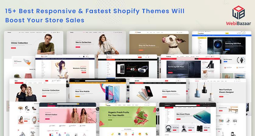
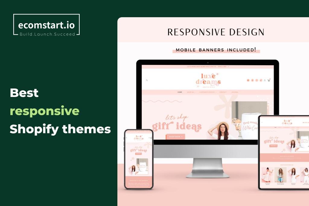
In today’s fast-paced digital landscape, having a stunning online store isn’t just a luxury; it’s a necessity. With mobile shopping on the rise—accounting for over 50% of all e-commerce traffic—ensuring your Shopify store looks great and functions seamlessly on smartphones and tablets is crucial for success. But how do you choose the right theme that not only captures your brand’s essence but also drives high conversions?
Fear not! In this article, we’ll dive into the 8+ best responsive Shopify themes that are specifically designed to enhance your mobile experience. These themes offer a perfect blend of aesthetics and functionality, ensuring your visitors are captivated at first glance and motivated to complete their purchases. Whether you’re a seasoned seller or just starting out, these handpicked themes will help you create an engaging shopping experience that keeps customers coming back for more. Ready to elevate your e-commerce game? Let’s explore the best options available!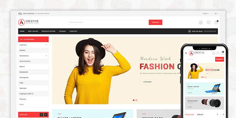
Choosing the Right Responsive Shopify Theme for Your Business
When it comes to launching a successful online store, selecting the right responsive Shopify theme is crucial. A well-designed theme not only enhances the aesthetic appeal of your site but also significantly boosts user experience, leading to increased customer engagement and higher conversion rates. Here are some essential factors to consider when choosing a theme:
- Mobile Optimization: Ensure the theme is fully responsive, meaning it adapts seamlessly to all screen sizes. With over half of online shopping done via mobile devices, a mobile-friendly theme is non-negotiable.
- Customization Options: Look for a theme that allows for easy customization. Flexibility in design means you can tailor your store’s appearance to align with your brand identity without needing extensive coding knowledge.
- Loading Speed: Choose themes optimized for fast loading times. A delay of even a few seconds can lead to cart abandonment and lost sales.
- Built-in SEO Features: Opt for themes that come equipped with SEO-friendly features. This will help your store rank better in search engines, driving organic traffic.
- Support and Updates: Select a theme from a reputable developer that provides ongoing support and regular updates, ensuring compatibility with the latest Shopify features.
To make your decision easier, here’s a quick comparison of some top-rated responsive Shopify themes:
| Theme Name | Mobile Friendly | Customization Options | SEO Features |
|---|---|---|---|
| Debut | ✔️ | ✅ Easy | ✅ Built-in |
| Brooklyn | ✔️ | ✅ Moderate | ✅ Optimized |
| Minimal | ✔️ | ✅ High | ✅ Friendly |
| Supply | ✔️ | ✅ Limited | ✅ Standard |
Remember that the best theme for your business is one that aligns with your specific needs and goals. Take your time to explore different options, demo them, and envision how they would represent your brand. A theme is not just a skin for your store; it’s a critical element that drives your online success. So choose wisely!
The Importance of Mobile Optimization in E-commerce Success
In today’s digital landscape, mobile optimization is not just an option; it’s a necessity for e-commerce success. With more than half of all online shopping happening on mobile devices, businesses that fail to optimize for mobile are likely to miss out on significant revenue opportunities. Responsive design ensures that your online store not only looks good on any screen size but also functions seamlessly, providing an exceptional user experience.
When users land on your site, the first impression matters immensely. A well-optimized mobile site can lead to higher conversion rates. With fast loading times and easy navigation, customers are more likely to complete their purchases rather than abandon their carts due to frustration. Consider the following benefits of mobile optimization:
- Improved User Experience: Mobile-friendly sites are easier to navigate, which enhances overall user satisfaction.
- Better Search Engine Rankings: Google and other search engines favor mobile-optimized websites, which can boost your visibility.
- Increased Accessibility: Mobile optimization allows consumers to shop from anywhere, anytime, increasing the likelihood of impulse purchases.
Moreover, responsive Shopify themes specifically designed for mobile can significantly reduce the resources needed to create an effective online store. These themes come with built-in features that cater to mobile users, such as touch-friendly buttons, optimized images, and simplified checkout processes. In fact, using a well-designed theme can yield impressive results:
| Feature | Benefit |
|---|---|
| Responsive Layout | Adaptable to all device sizes for a seamless experience. |
| Fast Loading Speed | Reduces bounce rates and keeps users engaged. |
| SEO-Friendly | Improves website ranking, attracting more traffic. |
Investing in mobile optimization can make a substantial difference in your overall sales performance. As users become increasingly accustomed to shopping via their smartphones, those who prioritize a mobile-first approach will find themselves at a distinct advantage. With the right tools and strategies, you can create an engaging, user-friendly shopping experience that converts visitors into loyal customers.
Top Features to Look for in a Mobile-Friendly Shopify Theme
When searching for a mobile-friendly Shopify theme, several key features can significantly enhance the user experience and drive conversions. Here are some essential elements that should be on your checklist:
- Responsive Design: A theme that automatically adjusts to various screen sizes ensures that customers have a seamless shopping experience, whether they are on a smartphone, tablet, or desktop. This adaptability not only improves usability but also contributes to better SEO rankings.
- Fast Loading Times: Time is of the essence in e-commerce. Opt for themes optimized for speed to minimize bounce rates. Utilize tools like Google PageSpeed Insights to gauge the loading times of potential themes.
- User-Friendly Navigation: Intuitive navigation is vital for mobile users. Look for themes that allow for easily accessible menus and search functionalities. Dropdowns and mega menus can greatly enhance the shopping experience.
Additionally, consider the following premium features that can further boost your site’s performance:
- Touch-Friendly Elements: Buttons and links should be easy to tap on mobile devices. Ensure that clickable elements have sufficient padding to prevent misclicks.
- Integrated Checkout Process: A streamlined checkout process is crucial for converting visitors into customers. Look for themes that offer mobile-optimized checkout solutions, minimizing the number of steps required to complete a purchase.
- Image Optimization: High-quality images are essential for showcasing products, but they should be optimized for mobile. Themes that handle image compression and scaling effectively will provide a better shopping experience.
| Feature | Importance | Benefit |
|---|---|---|
| Responsive Design | High | Improved User Experience |
| Fast Loading Times | High | Reduced Bounce Rates |
| User-Friendly Navigation | Medium | Easier Product Discovery |
| Touch-Friendly Elements | Medium | Enhanced Usability |
| Integrated Checkout Process | High | Higher Conversion Rates |
| Image Optimization | Medium | Better Load Times |
Ultimately, selecting the right mobile-friendly Shopify theme can set the stage for your store’s success. By prioritizing these features, you’ll not only enhance your customers’ shopping experience but also optimize your store for higher conversions. Don’t underestimate the power of a well-designed mobile interface—it’s often the first impression potential customers will have of your brand!
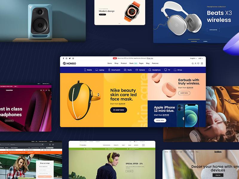
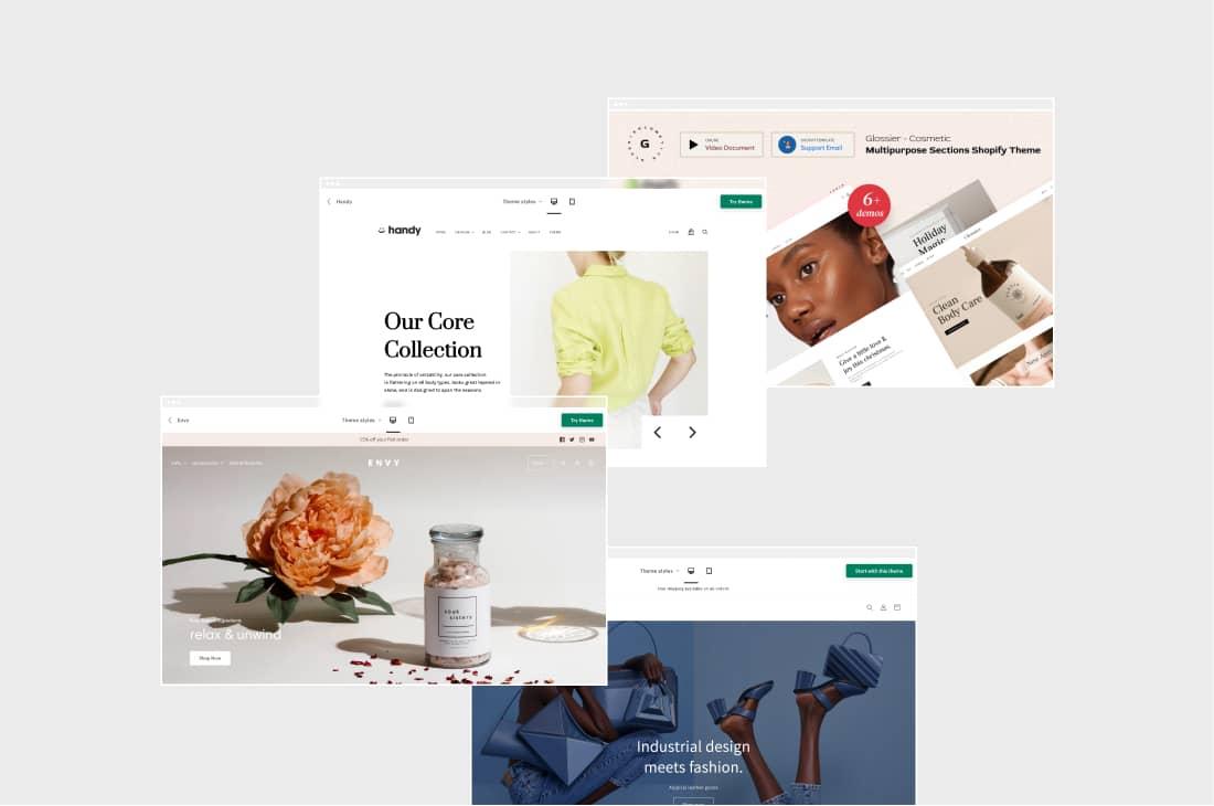
Showcasing the Best Shopify Themes for High Conversion Rates
In the ever-evolving world of e-commerce, having a visually appealing and user-friendly website is crucial for driving sales. When it comes to Shopify, choosing the right theme can significantly impact your conversion rates. Below, we explore some of the best responsive Shopify themes that not only look great on mobile devices but are also designed to maximize your sales potential.
Why Responsive Themes Matter
With more consumers shopping on their mobile devices than ever before, a responsive design is no longer optional. Here are a few reasons why:
- User Experience: A responsive theme adjusts seamlessly to any screen size, ensuring a smooth browsing experience.
- SEO Benefits: Google favors mobile-friendly sites, which can improve your search rankings and drive organic traffic.
- Increased Conversion: A well-designed mobile experience can lead to higher purchase rates, reducing bounce rates and cart abandonment.
Top Themes for High Conversions
Let’s dive into some themes that have proven effective in generating high conversion rates:
| Theme Name | Key Features | Best For |
|---|---|---|
| Turbo | Speed optimization, multiple layouts | High-volume stores |
| Minimal | Clean design, easy customization | Fashion & accessories |
| Booster | Conversion-focused tools, upselling features | All product types |
| District | Responsive sliders, promotional banners | Online boutiques |
| Venture | Multi-column menu, great for large catalogs | Outdoor & sports gear |
Each of these themes brings unique advantages to the table, making it easier to capture your audience’s attention and guide them through the purchasing journey. Moreover, they all offer intuitive customization options, allowing you to align the look and feel of your store with your brand identity.
Features that Enhance Conversions
When evaluating themes, look for these features that can significantly boost your conversion rates:
- Fast Loading Times: Ensure that your theme is optimized for speed to keep potential customers engaged.
- Easy Navigation: Simple and clear navigation can make a big difference in user experience, helping customers find what they need quickly.
- High-Quality Images: Themes that support high-resolution images can showcase your products beautifully, enticing customers to make a purchase.
- Built-in SEO Tools: Themes that come with SEO features can help you rank better and attract more visitors.
Choosing the right Shopify theme is a critical step in creating a successful online store. By prioritizing responsiveness and conversion-oriented features, you’ll set your business up for sustained growth and success.
User Experience Matters: Themes That Enhance Customer Journey
In today’s digital landscape, a seamless user experience is crucial for retaining customers and maximizing conversions. When it comes to Shopify themes, the right choice can significantly enhance your online store’s performance. With a plethora of responsive themes available, it’s essential to focus on those that not only look great on mobile devices but also offer features that simplify the customer journey.
Here are some key themes that can elevate your Shopify store:
- Flexible Layouts: Choose themes that allow for easy customization. A theme with a flexible layout ensures that your products are presented in a way that is both appealing and easy to navigate.
- Fast Loading Times: Site speed greatly affects user satisfaction. Opt for themes that are optimized for performance to keep your customers engaged without unnecessary delays.
- Intuitive Navigation: Simplified menus and easily accessible categories help users find what they need quickly. A theme with a clear navigation structure can lead to higher conversion rates.
- Mobile Optimization: With a significant amount of shopping now occurring on mobile devices, responsive themes ensure that your site looks and functions flawlessly on any screen size.
- Integrated Social Proof: Look for themes that easily incorporate customer reviews and testimonials. Social proof can significantly influence purchasing decisions.
To further assist you in your selection, here’s a quick comparison of some standout responsive Shopify themes:
| Theme Name | Mobile-Friendly | Customization Options | Conversion Features |
|---|---|---|---|
| Debut | ✅ | High | Product recommendations |
| Brooklyn | ✅ | Moderate | Image sliders |
| Supply | ✅ | High | Collection filtering |
| Minimal | ✅ | High | Easy social sharing |
By investing in a responsive theme that aligns with your brand and customer needs, you pave the way for an enhanced shopping experience. Remember, a well-designed theme is not just about aesthetics; it’s about creating a user-friendly environment that encourages customers to explore, engage, and ultimately, convert.

Customization Options: Making Your Store Stand Out on Mobile
In today’s digital landscape, having a mobile-friendly store is essential for capturing and retaining customers. With the right customization options, you can transform a standard Shopify theme into a unique, engaging shopping experience that resonates with your audience. Here are some key strategies to enhance your mobile store’s appearance and functionality:
- Personalized Branding: Integrate your brand colors, fonts, and logos throughout your mobile site. This creates a cohesive look that boosts brand recognition and trust.
- Dynamic Visuals: Use high-quality images and videos that showcase your products. Consider implementing a hero image or video on the homepage that is optimized for mobile viewing, as it can grab attention and convey your brand message effectively.
- Unique Layouts: Experiment with grid or list layouts to display products. A clean, intuitive design helps users navigate easily, while custom categories allow customers to find what they’re looking for in a snap.
Moreover, interactive elements can significantly enhance user engagement. Implement features such as:
- Tap-Friendly Buttons: Ensure that your buttons are large enough and spaced adequately for easy tapping. This small change can reduce friction during the checkout process.
- Live Chat Support: Add a chat feature to provide immediate assistance, making customers feel valued and more likely to complete their purchases. A responsive customer service option can set your store apart from competitors.
- Personalized Recommendations: Use algorithms to display tailored product suggestions based on browsing history. This not only increases the chances of additional sales but also enhances the shopping experience.
To further optimize your mobile store, consider the following layout adjustments:
| Element | Mobile Optimization |
|---|---|
| Navigation Menu | Simple, collapsible design for easy access. |
| Product Pages | Large images with quick view options to streamline selection. |
| Checkout Process | Single-page checkout for a faster transaction. |
don’t underestimate the power of feedback. Utilize customer reviews and ratings prominently on your mobile store to build trust and encourage new buyers. A dedicated section for testimonials can also enhance your credibility, making your store more appealing to potential customers. By implementing these customization options, you can create a mobile shopping experience that captivates users and drives conversions.

Responsive Design: Why It’s a Game Changer for E-commerce
In today’s digital landscape, mobile devices account for more than half of all web traffic. This surge in mobile usage has made responsive design a critical component of any successful e-commerce strategy. When your Shopify store is optimized for all screen sizes, you not only enhance user experience but also significantly boost conversion rates. Customers expect a seamless shopping experience, and responsive themes deliver just that.
One of the standout features of responsive design is its ability to automatically adjust your site’s layout, images, and content based on the device being used. This means that whether your customers are browsing on a smartphone, tablet, or desktop, they will enjoy an optimized experience without any manual adjustments. Let’s dive into the key benefits that make responsive design a game changer for e-commerce:
- Improved User Engagement: A mobile-friendly site keeps users engaged longer, which can lead to increased sales.
- Higher Conversion Rates: A responsive design reduces the bounce rate, encouraging shoppers to complete their purchases.
- SEO Advantages: Google favors mobile-optimized websites, giving you a better chance of ranking higher in search results.
- Cost Efficiency: Maintaining one responsive site is more cost-effective than managing separate mobile and desktop versions.
Furthermore, let’s not forget about the importance of aesthetics. A well-designed responsive Shopify theme not only attracts customers but also builds credibility and trust. Customers are more likely to purchase from a site that looks polished and professional, regardless of the device they are using. This visual appeal can be the difference between a sale and an abandoned cart.
| Responsive Theme Features | Benefits |
|---|---|
| Fluid Grids | Adapt to various screen sizes without losing design integrity. |
| Flexible Images | Automatically resize images to fit any screen, enhancing load times. |
| Media Queries | Customize CSS styles based on device characteristics for optimal performance. |
| Touchscreen Readiness | Ensure easy navigation for mobile users, leading to a smoother shopping experience. |
As you explore the best responsive Shopify themes, consider how each one aligns with your brand’s identity and customer expectations. Taking the time to choose a theme that not only looks great but functions seamlessly across devices will set you up for e-commerce success. Remember, in the world of online shopping, first impressions matter, and a responsive design can make all the difference in capturing and retaining customers.
Real-Life Success Stories: Brands Thriving with These Themes
In the ever-evolving digital landscape, several brands have harnessed the power of responsive Shopify themes to elevate their online presence and achieve remarkable success. Below, we highlight a few standout brands that have thrived by effectively utilizing these themes, showcasing their unique strategies and impressive results.
Brand A: The Eco-Friendly Innovator
Brand A embraced a responsive Shopify theme that emphasized sustainability and clean design. Their website features vibrant visuals and intuitive navigation, making it easy for customers to discover eco-friendly products. As a result, they saw a 35% increase in mobile conversions within just three months. This theme’s ability to adapt seamlessly to different devices enabled Brand A to capture a wider audience and boost sales significantly.
Brand B: The Fashion Forward
By choosing a sleek and modern theme, Brand B transformed its online store into a fashion hub that resonates with style-savvy shoppers. The incorporation of high-quality images and an engaging layout led to a 50% rise in user engagement. Customers enjoy a personalized shopping experience, which is reflected in the brand’s growing social media following and an impressive 40% increase in repeat purchases.
Brand C: The Tech Titans
Brand C targeted tech enthusiasts with a responsive theme that showcased their innovative products through dynamic features. The theme’s fast loading times and user-friendly interface enhanced the overall shopping experience, leading to a remarkable 30% increase in sales. The integration of customer reviews directly on product pages helped build trust, further driving conversions.
Key Takeaways from Their Success
| Brand | Theme Features | Results |
|---|---|---|
| Brand A | Vibrant visuals, intuitive navigation | 35% increase in mobile conversions |
| Brand B | Sleek design, personalized experience | 50% rise in user engagement |
| Brand C | Fast loading, dynamic features | 30% increase in sales |
These real-life success stories serve as powerful reminders of the impact that choosing the right theme can have on an online business. The combination of visually appealing designs, easy navigation, and responsive features play a crucial role in engaging customers and driving conversions.
Tips for Optimizing Your Shopify Store Beyond Theme Selection
Choosing the right theme for your Shopify store is crucial, but several other factors can significantly enhance your store’s performance and user experience. First and foremost, implementing SEO best practices can drive organic traffic to your site. Focus on optimizing your product titles, meta descriptions, and alt tags for images. This will not only help search engines understand your content but also improve your visibility in search results.
Next, consider the loading speed of your website. A slow-loading page can deter potential customers and increase your bounce rate. Tools like Google PageSpeed Insights can help you analyze your store’s speed and offer suggestions for improvement. Simple actions, such as compressing images and reducing redirects, can noticeably enhance your site’s performance.
Another area to focus on is mobile optimization. While you may have chosen a responsive theme, ensuring that your store is fully optimized for mobile users is essential. Test your store on various devices to confirm that all elements function smoothly. This includes checking navigation, product displays, and checkout processes. Remember, a seamless mobile experience can lead to higher conversion rates.
Customer engagement is also a vital component of a successful online store. Utilize tools like live chat or chatbots to provide real-time support for your customers. Additionally, encourage customer reviews and testimonials to build trust and credibility. A well-placed review section can greatly influence potential buyers’ decisions.
don’t overlook the importance of analytics and data tracking. Utilize Shopify’s built-in analytics or integrate Google Analytics to monitor your store’s performance. Analyze customer behavior and sales data to inform your marketing strategies and optimize your inventory management, ensuring you’re meeting customer demand effectively.
| Optimization Area | Key Actions |
|---|---|
| SEO | Optimize titles, meta descriptions, and use alt tags |
| Loading Speed | Compress images, reduce redirects |
| Mobile Optimization | Test on various devices, ensure smooth navigation |
| Customer Engagement | Implement live chat and encourage reviews |
| Analytics | Monitor performance and analyze customer behavior |
Get Started Today: Turning Your Vision into Reality with the Perfect Theme
Have you ever felt overwhelmed by the endless choices in creating your online store? Choosing the right theme for your Shopify store is the first step towards transforming your vision into reality. A well-designed theme not only enhances the aesthetic appeal of your website but also plays a crucial role in driving conversions. With so many responsive options available, you can find the perfect fit for your brand’s unique identity.
When selecting a theme, consider these key attributes that can significantly impact user experience:
- Mobile Responsiveness: Ensure your theme looks and functions flawlessly on all devices. A mobile-optimized store captures a wider audience and improves sales.
- Customization Options: Look for themes that allow you to easily modify colors, fonts, and layouts, so you can maintain brand consistency.
- SEO-Friendly: Choose a theme that is built with search engine optimization in mind to boost your online visibility.
- Speed Optimization: A well-coded theme will load quickly, enhancing user experience and reducing bounce rates.
In addition to these attributes, consider how your chosen theme supports your specific business goals. For example, if you focus on selling fashion items, look for themes that emphasize high-quality images and product showcases. If you’re aiming for high conversions, features such as integrated checkout processes and user-friendly navigation should be top of mind.
To help you compare your options, here’s a quick overview of some of the standout responsive Shopify themes available today:
| Theme Name | Best For | Key Features |
|---|---|---|
| Debut | All types of stores | Easy to set up, customizable, responsive |
| Brooklyn | Fashion stores | Product gallery, slideshow, mobile-first |
| Minimal | Art and photography | Clean design, image-focused, SEO-friendly |
| Supply | Large inventories | Collection filtering, inventory management |
Choosing the right theme is not just about aesthetics; it’s about creating an engaging experience that resonates with your target audience. By investing time in selecting a theme that aligns with your vision and business objectives, you set the groundwork for a successful online store that not only attracts visitors but also converts them into loyal customers.
Frequently Asked Questions (FAQ)
Sure! Below is a Q&A format for an article titled “8+ Best Responsive Shopify Themes for Mobile & High Conversions.”
Q1: Why is having a responsive Shopify theme important for my online store?
A1: Having a responsive Shopify theme is crucial because it ensures that your online store looks and functions beautifully on any device—whether it’s a desktop, tablet, or smartphone. With more than half of all web traffic coming from mobile devices, a responsive design enhances user experience and lowers bounce rates. This means happier customers and, ultimately, higher conversion rates!
Q2: What should I look for in a responsive Shopify theme?
A2: When searching for a responsive Shopify theme, prioritize flexibility, speed, and ease of customization. Look for themes that are mobile-optimized and provide a seamless shopping experience. Features like quick loading times, intuitive navigation, and mobile-friendly checkout processes are also key. You want a theme that not only looks great but also helps your customers make purchases effortlessly.
Q3: Can a well-designed Shopify theme really improve my store’s conversions?
A3: Absolutely! A well-designed Shopify theme can significantly improve your store’s conversion rate. An engaging and intuitive design captivates your visitors and encourages them to explore more products. By streamlining the shopping experience and making it visually appealing, you decrease the chances of cart abandonment and increase sales. First impressions matter, and a professional theme can instill trust and confidence in your brand.
Q4: Are these responsive Shopify themes easy to customize?
A4: Most of the best responsive Shopify themes are designed with user-friendliness in mind. They come with built-in customization options that allow you to tweak colors, fonts, and layouts without needing to know any code. Additionally, many themes offer demo content and drag-and-drop builders, making it easier than ever to create a unique look that aligns with your brand identity.
Q5: How do I choose from the 8+ responsive Shopify themes in your list?
A5: Start by identifying your store’s specific needs and aesthetic preferences. Consider your target audience and the types of products you’re selling. Do you want a minimalist design or something vibrant and bold? Once you narrow it down, test out the themes by looking at their demos. Check how they perform on mobile devices and see if they offer the features that will help convert visitors into customers.
Q6: Will these themes keep up with the latest design trends?
A6: Yes! The themes on our list are regularly updated to reflect current design trends and best practices. This means you won’t just get a theme that looks good now; you’ll have a responsive design that stays relevant as trends evolve. Staying up-to-date with the latest in e-commerce design helps you maintain a professional and appealing online presence.
Q7: How can I ensure my store stands out with these themes?
A7: To make your store stand out, focus on branding and personalization. Use high-quality images, compelling product descriptions, and unique branding elements like logos and colors that reflect your brand’s personality. Additionally, leverage the customization options available in your chosen theme to create a one-of-a-kind shopping experience that resonates with your audience.
Q8: What if I need support after choosing a theme?
A8: Most reputable Shopify themes come with great customer support. Whether it’s setup assistance or troubleshooting, you often have access to documentation, FAQs, and a support team ready to help you. Don’t hesitate to reach out if you run into any issues; they’re there to ensure you have a smooth experience.
Conclusion: Investing in a responsive Shopify theme is not just about aesthetics—it’s a strategic move to boost your conversions and enhance user experience. Ready to elevate your online store? Check out our list of the 8+ best responsive Shopify themes today!
—
Feel free to modify any part of this Q&A to fit the specific content or themes you are writing about!
Wrapping Up
As we wrap up our exploration of the 8+ best responsive Shopify themes designed for mobile and high conversions, it’s clear that the right theme can make all the difference in elevating your online store. With mobile shopping on the rise, investing in a responsive design isn’t just a trend—it’s a necessity.
Remember, a well-optimized, visually appealing theme not only enhances the user experience but can also boost your sales and improve customer loyalty. Each theme we’ve highlighted has its unique features, ensuring that no matter your niche or brand personality, there’s a perfect match waiting for you.
So, why wait? Dive in, explore these options, and choose a theme that not only reflects your brand but also meets your customers’ needs. Your dream store is just a click away, and with the right responsive Shopify theme, you’ll be well on your way to transforming casual visitors into loyal buyers. Let’s get started on crafting the online store of your dreams!
